Leader Tools for SEL Programs
Evolving a teacher platform into a district leader experience
Backdrop
Second Step® is one of the first Social-Emotional Learning programs to enter Elementary schools. Its rich 30-year-old history dates back to black and white VHS tapes!
In 2020, I helped design the release of a new Second Step platform to empower educators and counselors to teach the program from online, accessible, and beautifully designed interactive lessons. Today we have extended the K-5 program to become K-12 with SEL for Adults professional development, all on the same digital platform.
The program continues to be a classroom experience but to increase impact, districts should roll out the program districtwide. In this project, I'll focus on how we approached scaling the digital platform to give district leaders the tools they need to be successful in systemic implementation.
District leaders comprise over 80% of Second Step’s purchasers, and play an essential role in supporting principals, counselors, and staff to adopt the program by ensuring that adequate support is in place year-round. A key job these leaders play is monitoring program adherence, and they need to somehow answer key implementation questions.
Are we on track? Who needs help? Which schools are excelling?
The platform in 2022 required district leaders to download a CSV report for every school, and it was extremely cumbersome, insufficient, and even inaccurate.
Discovery Phase Highlights
Empathy First: Interviews
I interviewed many people to learn the needs and perspectives of different stakeholders. This included district SEL leaders, school principals, counselors, client support staff, product managers, engineering, instructional design, implementation scientists, and research.
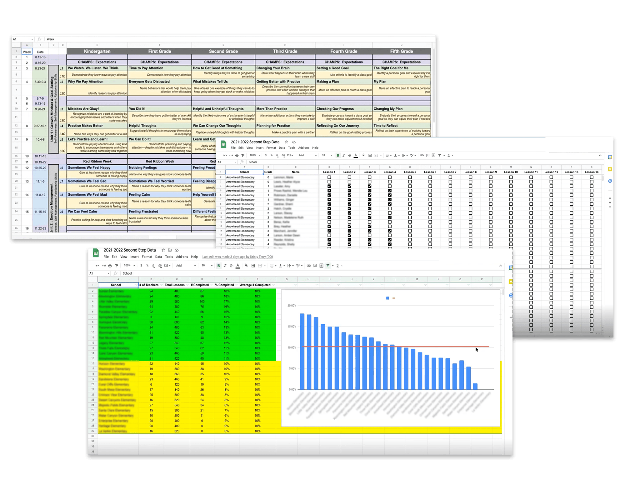
Custom reports that leaders created to make up for the lack of capabilities in our platform:
Affinity map of themes heard throughout over a dozen interviews:
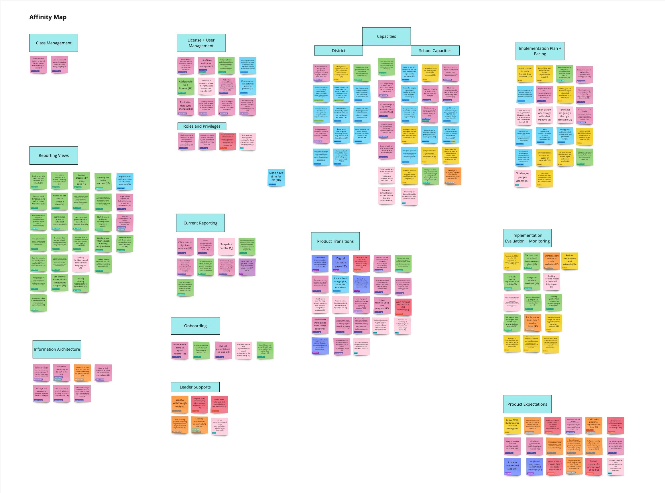
Key Learnings from Interviews:
Make data accurate, usable, consumable, and reliable.
Give me a district view where I drill up or down across schools.
Lesson progress is important, but staff and school activity is also meaningful.
Show me "Bright Spots" where it is going well across and within schools.
I’m not teaching lessons, but still need easy program access.
Measure the Experience: Benchmark Usability Study
To improve the experience for leaders, I conducted a usability study of the administrative features in the platform. This gave us a based for the usability of our current features.
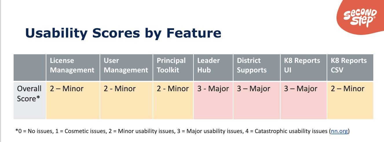
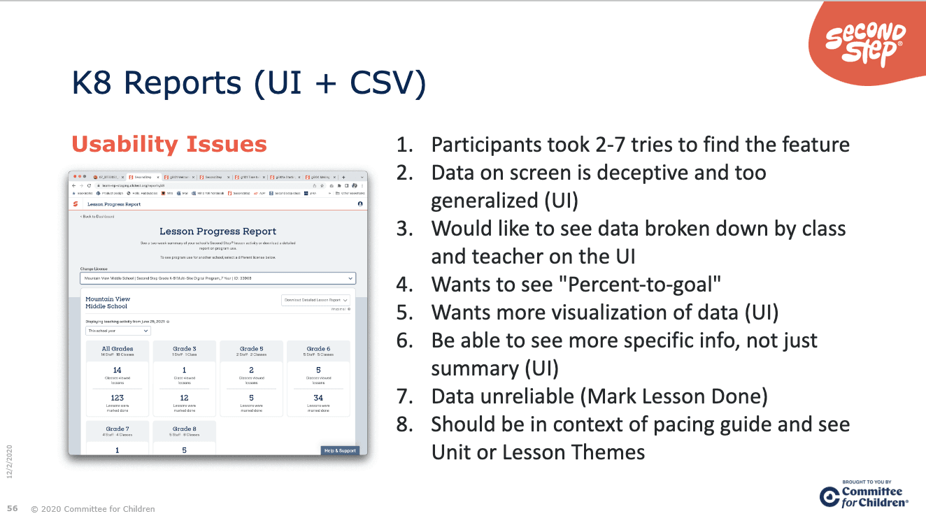
Key Learnings from Usability Study:
License and User Management generally met expectations. However, small UX enhancements could reduce the errors observed.
Leaders loved the robust content in the PTK, Leader Hub, and District supports, but often described these sections as "overwhelming" and "hard to find things".
K8 CSV reports generally meet user expectations but can be difficult for non-spreadsheet-software people. The current reporting UI for reports did not meet expectations.
Visualize the Problem and the System
Armed with insights from interviews, usability studies, customer support tickets, and competitive analysis we could map the goals and pain points across personas with a higher degree of confidence.
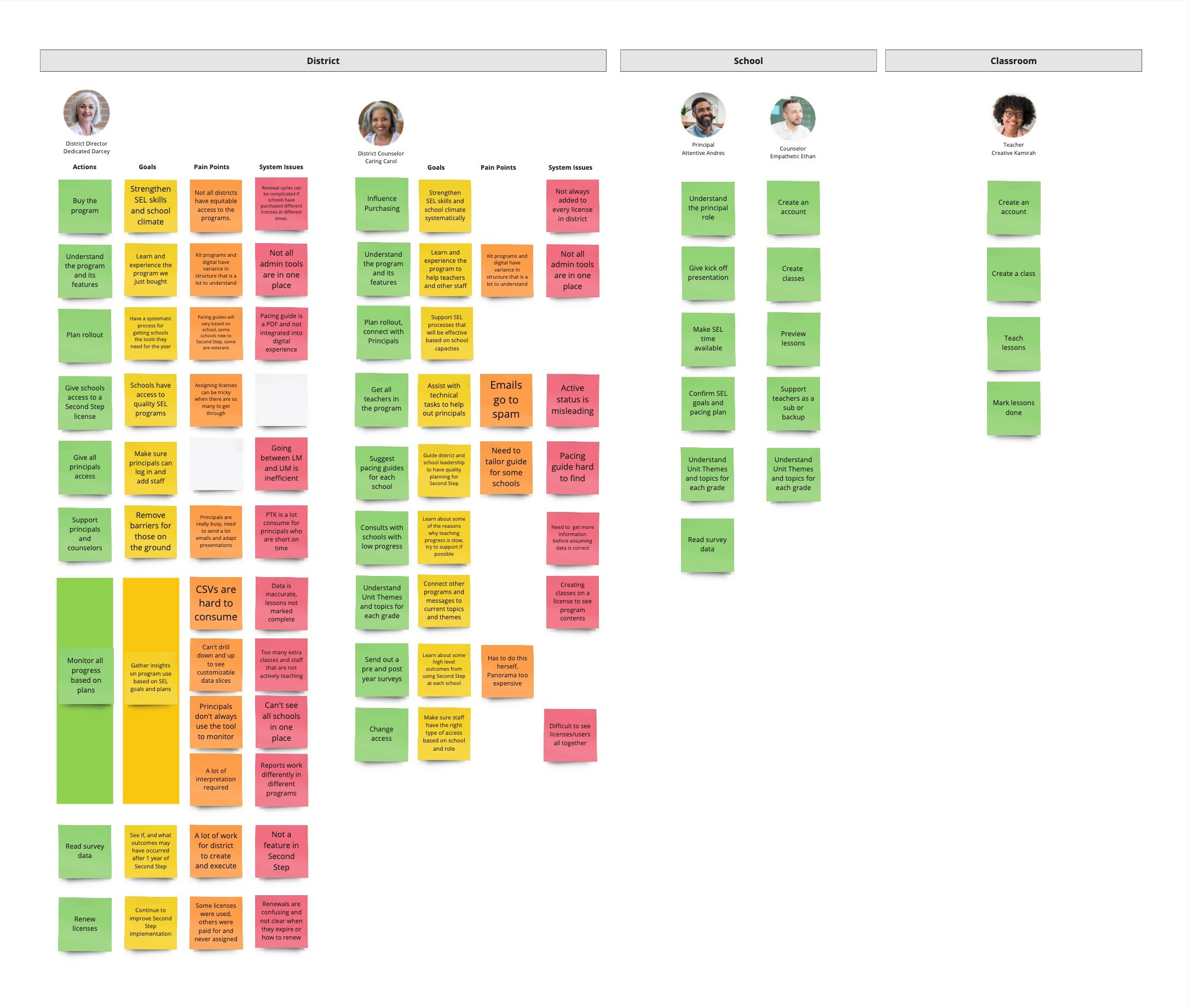
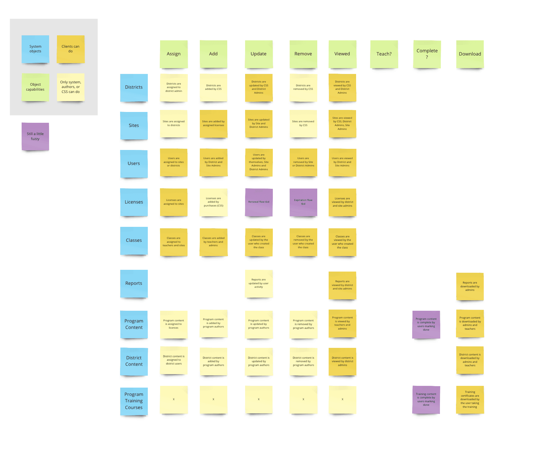
Using object-oriented UX, this map exposes all the models that we should have and their needed capabilities:
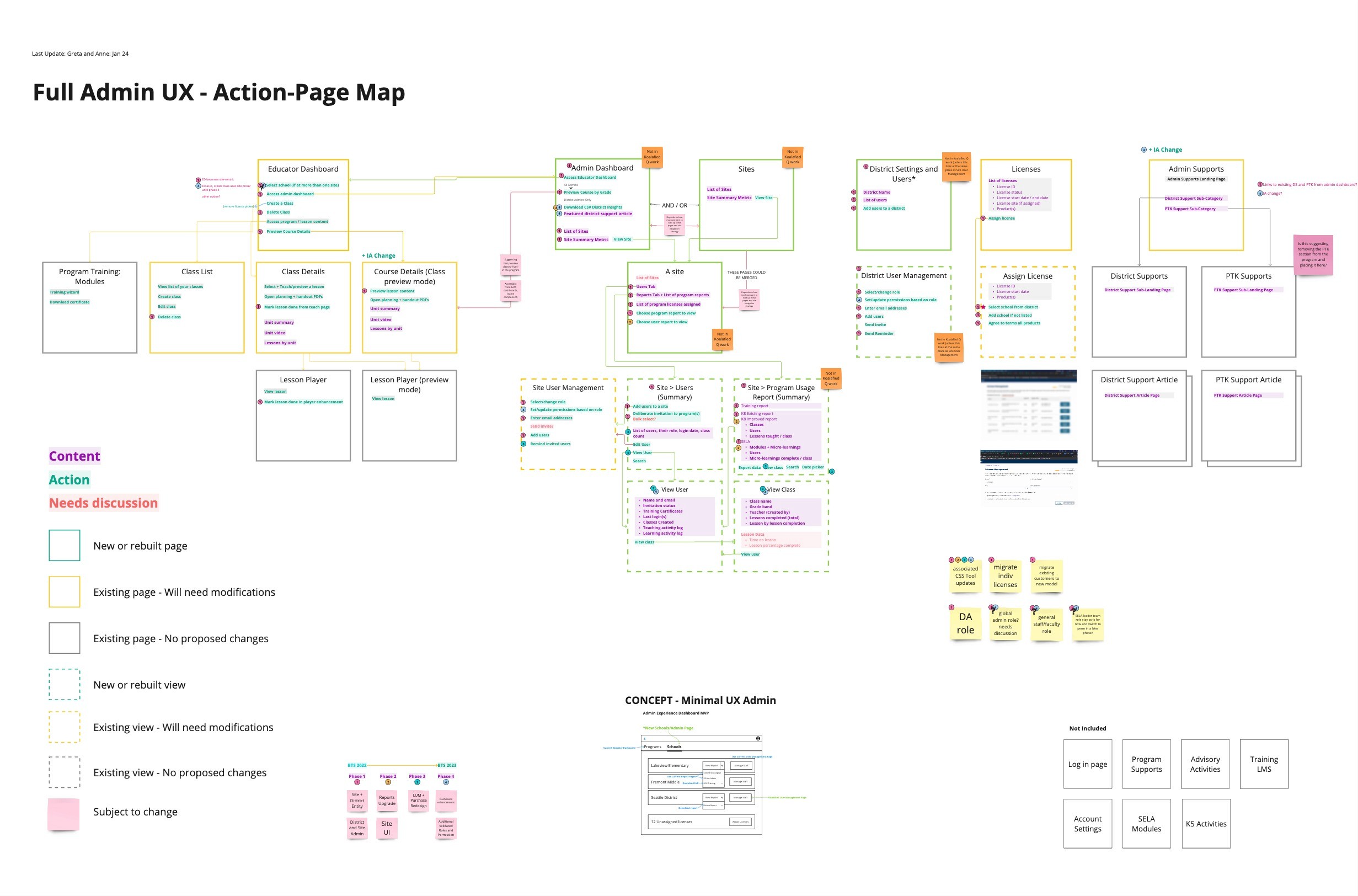
Wireflow maps how those objects work together and where actions occur across the platform:
A user flow that illustrates the completion of tasks within the entire school's journey:

After the problems and system were visualized, and the user flows clarified, I hosted a prioritization mapping workshop that connected top user needs with the interventions that would alleviate significant pain points:
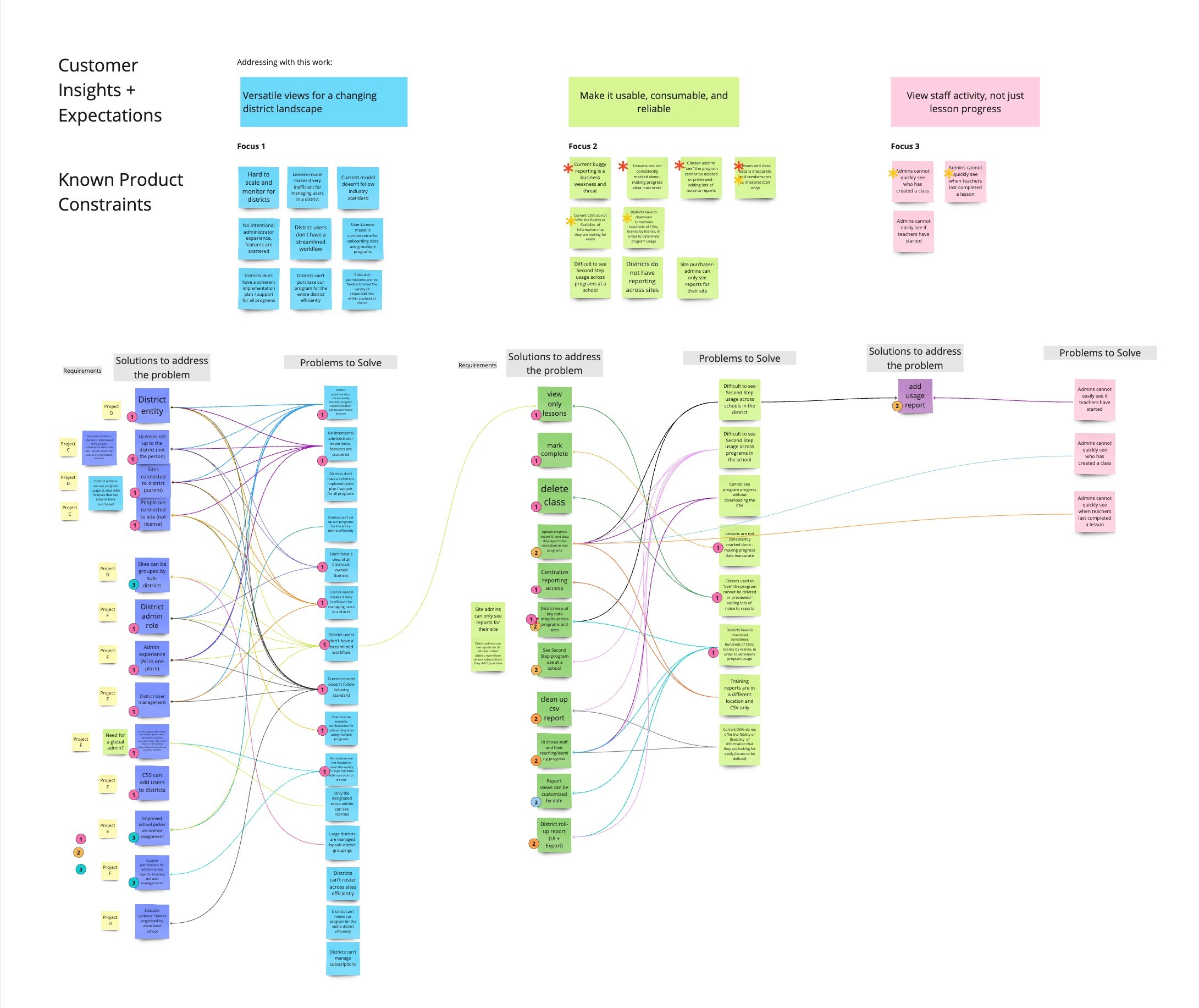
Key Learning from Systems Mapping:
With visuals mapped from the themes learned in interviews and usability sessions, the extended team could see the why behind the need to shift to a school model and be honest about why improving data quality cannot be overlooked.
These maps clarified where design interventions can have the biggest impact across personas.
The maps also increased our consultative capacity, shared understanding, and the team's motivation.
Design Process Highlights
Problems defined; take it one step at a time:
This User-Needs Summary encapsulates the learned themes and priorities across different research sources. We looked at both alleviating challenges and improving satisfaction with requested capabilities.
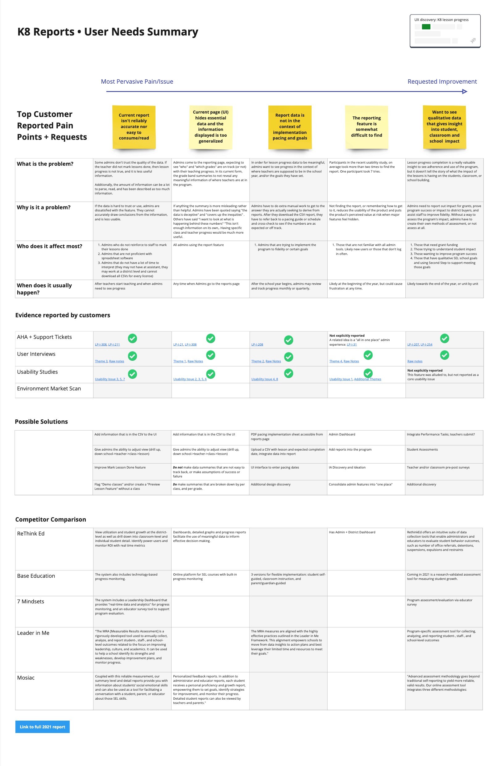
Addressing Pain Point 1: Clean the data
We learned that a data report with bad data is no better than no data at all. We needed to take three interventions that related to the teacher's experience to get reliable data for administrators. These enhancements were chosen with a hypothesis that they would get at the root cause of excess or inaccurate data.
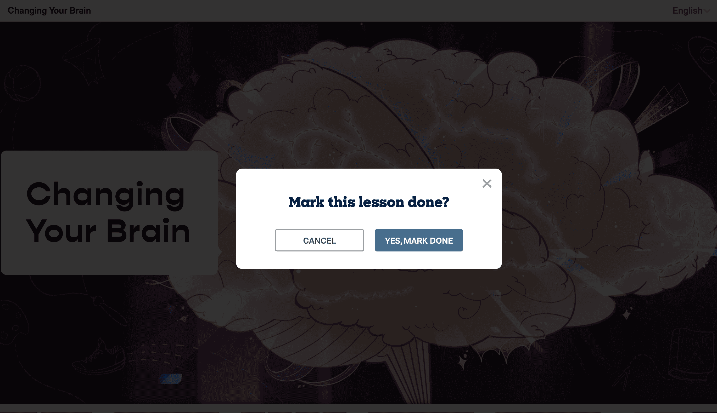
Intervention 1: The “Explore lessons” feature reduced extra classes by 85%. The feature also created easier lesson access for all users. This feature was well received soon after release, administrators and teachers adopted the "explore lessons" language in their interviews and comments, signifying that it was intuitive and useful.
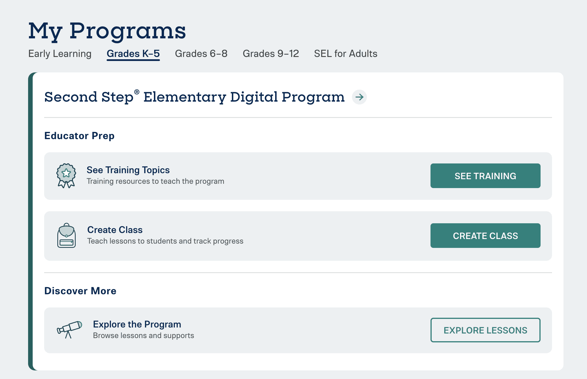
Intervention 2: The “Delete class” feature was long overdue and helped clean progress reports and remove the clutter of extra classes on the user's dashboard.
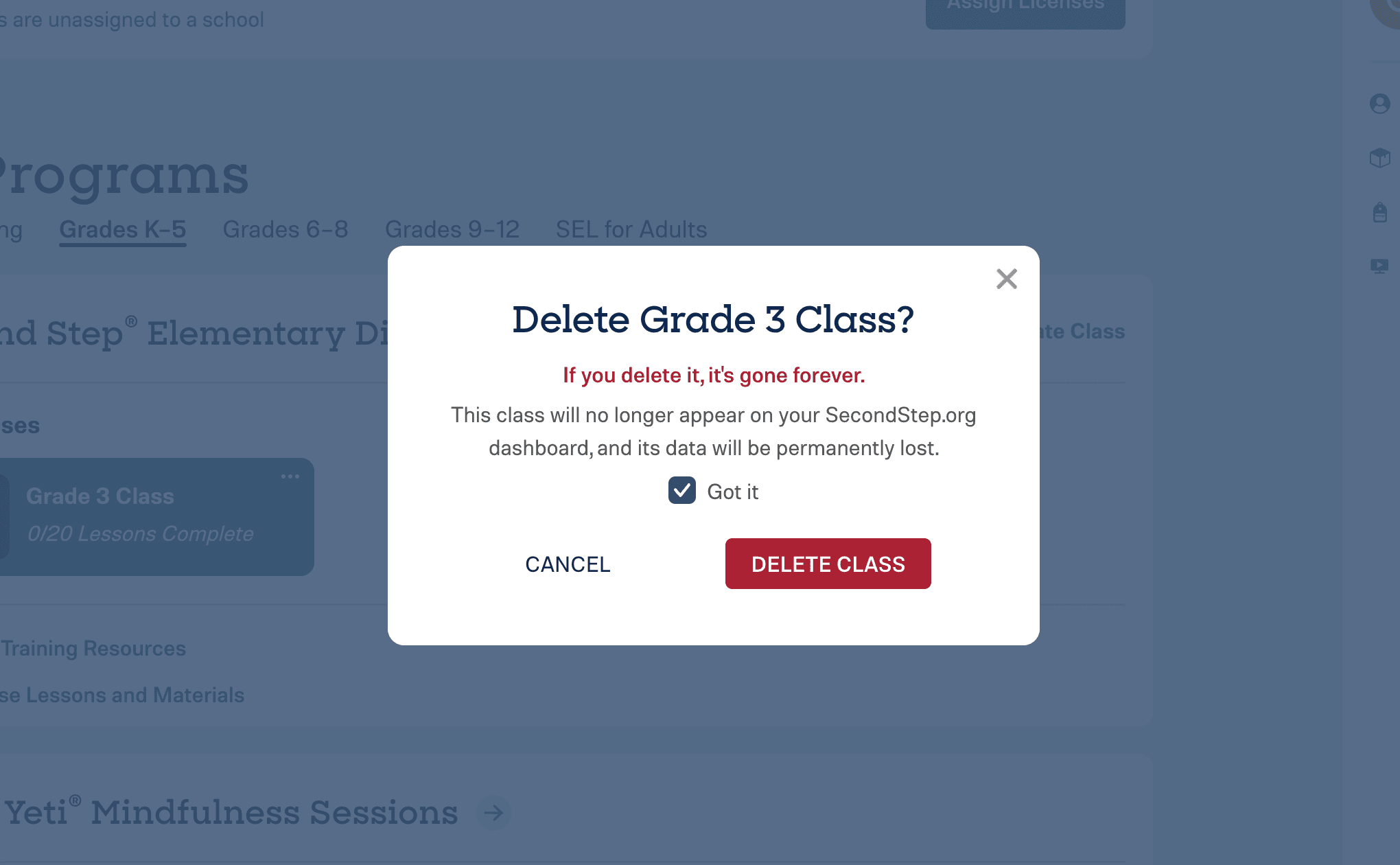
Intervention 3: The “Mark done” modal on the lesson player would appear to remind teachers to mark their lessons done. This also helped with increasing our post-lesson teacher lesson survey completion rates!
Learnings and Outcomes from the Data Clean-Up project:
By listening to the top pain points expressed by leaders and digging into the root causes, we prioritized the importance of three independent interventions. Sometimes the "solution" must be multi-pronged.
After completing all three interventions, our confidence in explicitly sharing lesson completion rates increased greatly, allowing us to make more robust UI designs.
85% reduction in excess classes
32% higher lesson completion rates
Not only did we meet the needs for accurate data, but we also gained many other experience wins:
Greater access for teachers and leaders to use and explore program materials.
Teachers keep their dashboards tidy for quicker class selection.
An increase in lesson feedback surveys exceeded our Survey Monkey limit of 5000 forms a month!
Addressing Pain Point 2: Get the School Data in the UI
With reliable data on the horizon, we got serious about building a UI for the important class data only available in a CSV download. A few design requirements we took from leaders into consideration were:
Drill up and down from school, grade, and class.
Make sure the data is not misleading.
Be kind with the data. We should show progress in a neutral tone.
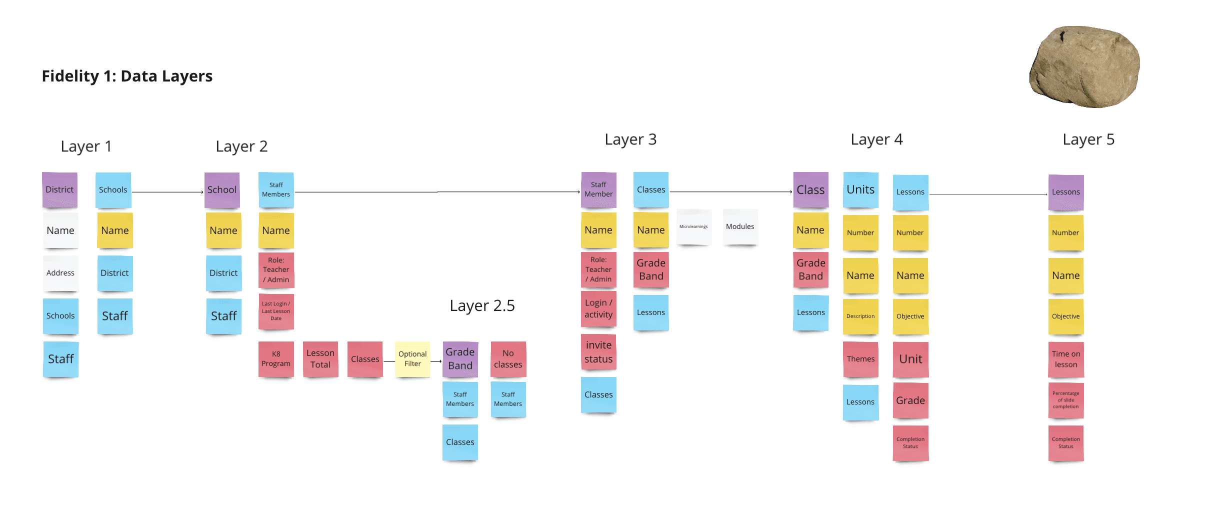
An abstract view of the data layers and data types for leaders to move through:
A higher fidelity view for how we can pivot the data:
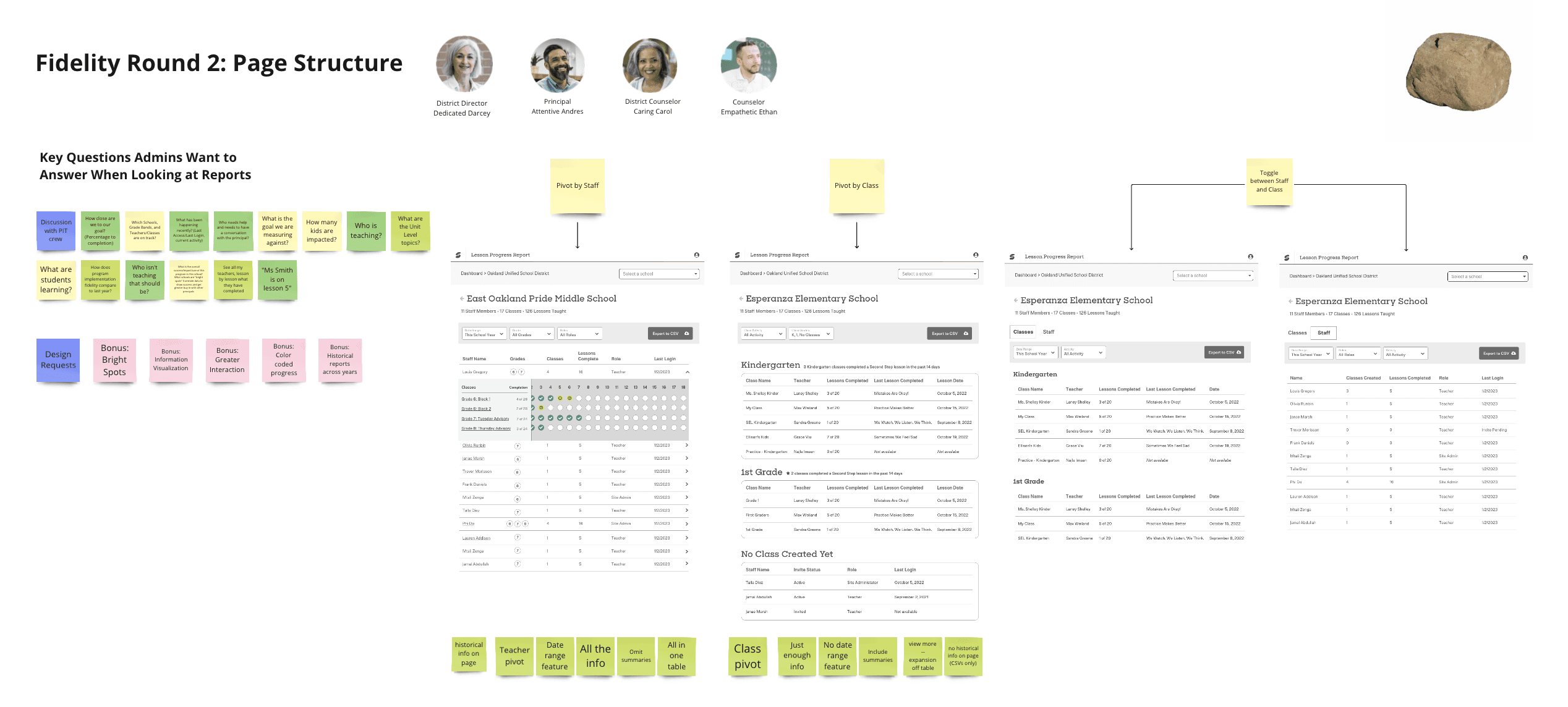
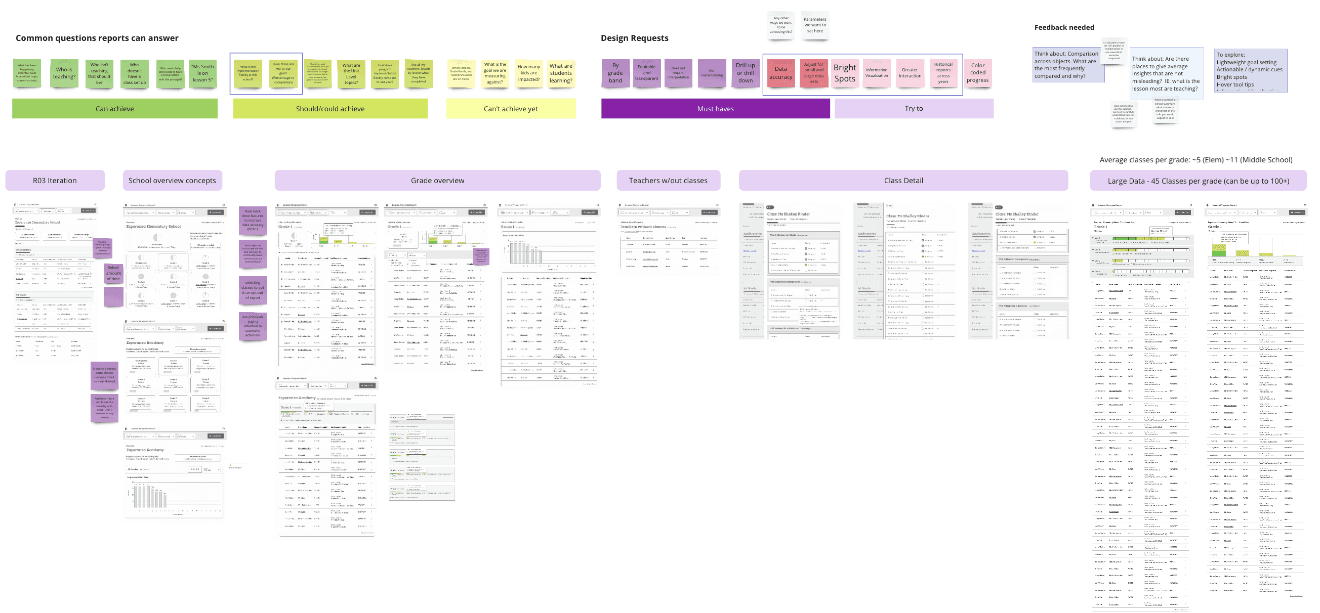
We explored multiple integrated features such as hiding classes, entering pacing goals, filtering, and seeing a summary. I tried different data visualization ideas and stress-tested the capacity of data from low to high usage:

Setting up an A/B usability design test:
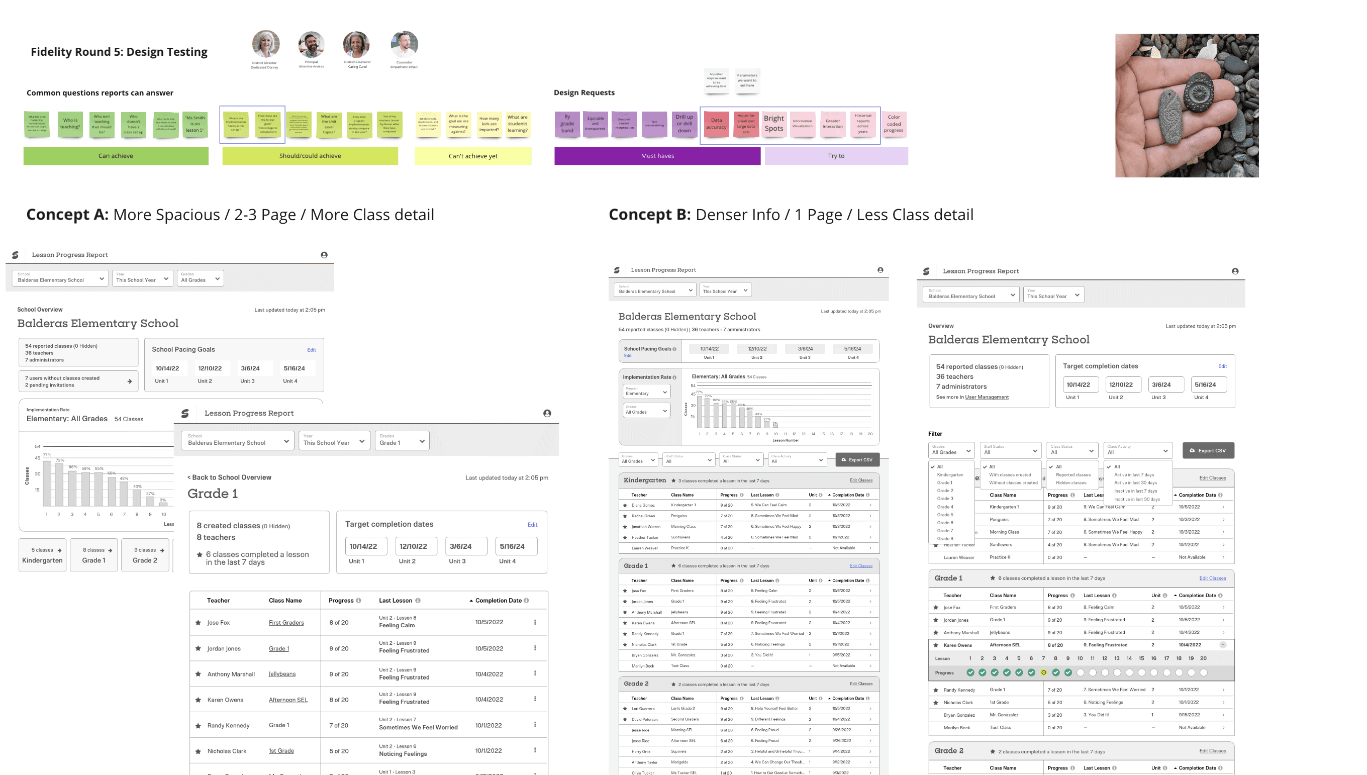
Improving the UX based on design testing feedback and completing the UI 🎉:
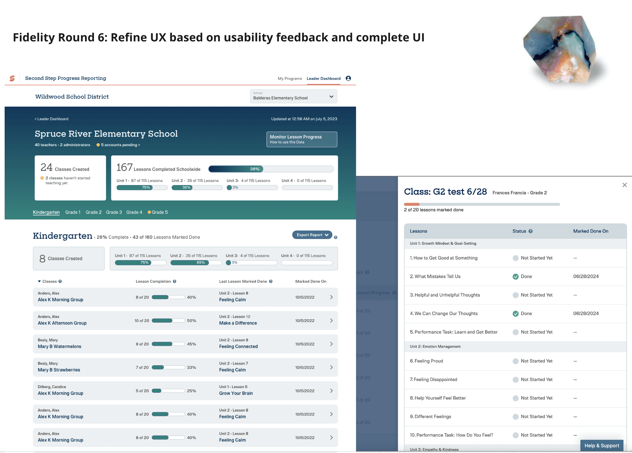
Key Learnings:
With every round of iteration, we kept SEL Leader's top goals and questions at the heart of evaluating design success.
By breaking down the process in different layers, we were able to systematically get to the data structure that was intuitive and scalable for future data points.
Testing the low-data and high-data scales helped us to see which designs had longevity and scale, while also being mindful of usability and cognitive load.
Be attentive that data is not misleading if proper context is not available. We did our best to be kind with the data, not punitive.
We explored feature enhancements that knew were out of scope, but wanted to learn how they landed while having the opportunity to test designs.
Addressing Pain Point 3: Support a district reporting view
Method 1: Design Sprint
In January 2023, we committed to launch a brand new leader dashboard by June 2023. At this point, there was no such place in the platform for a district dashboard. As the lead designer, I got buy-in to do a design sprint to kick us off in the right direction, as I knew that the amount of work required in this timeline would depend on some expedited design research.
Our design team of 3 dedicated a whole sprint to plan, design, test, refine, test, refine, and share back our progress.
The goal of the design sprint was not to have a completed wireframe of the dashboard, our goal was to test out many different ideas of data visualization, layout, and features, and directly integrate participant ideas into the design.
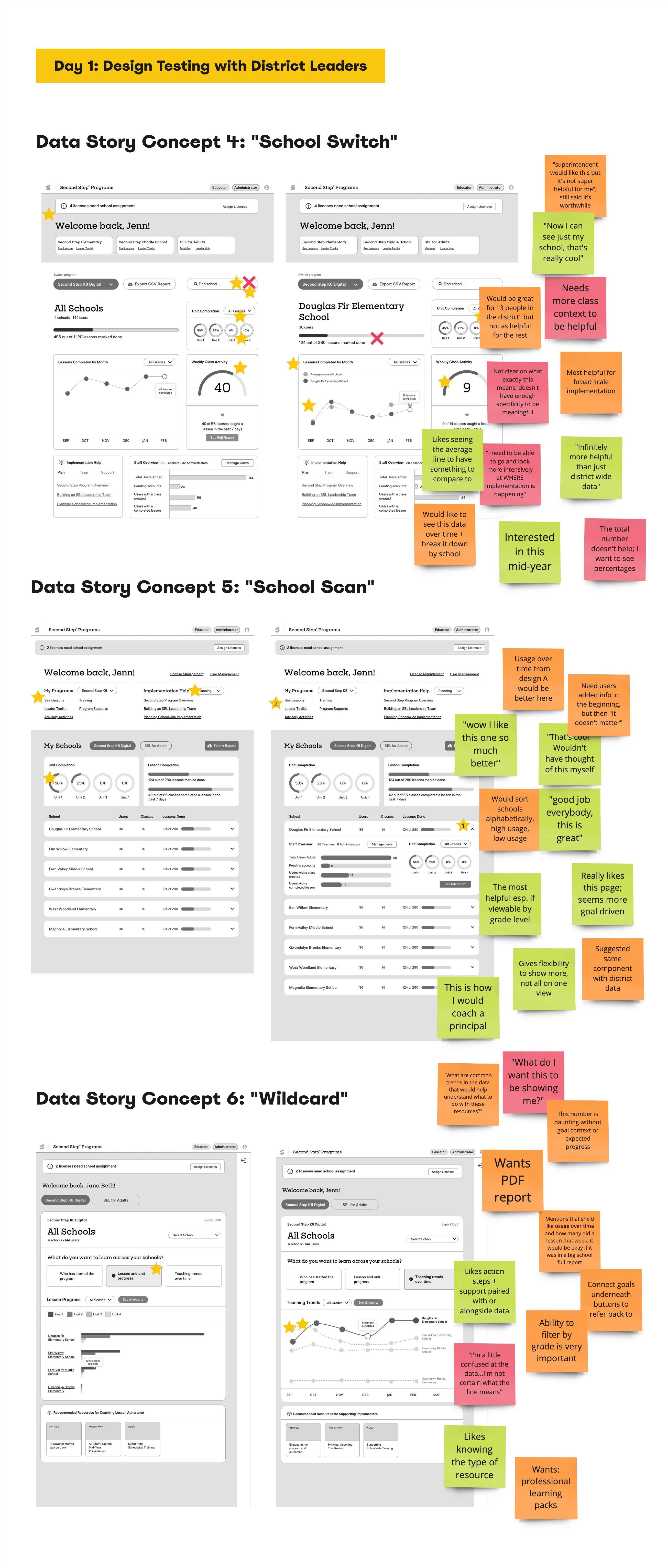
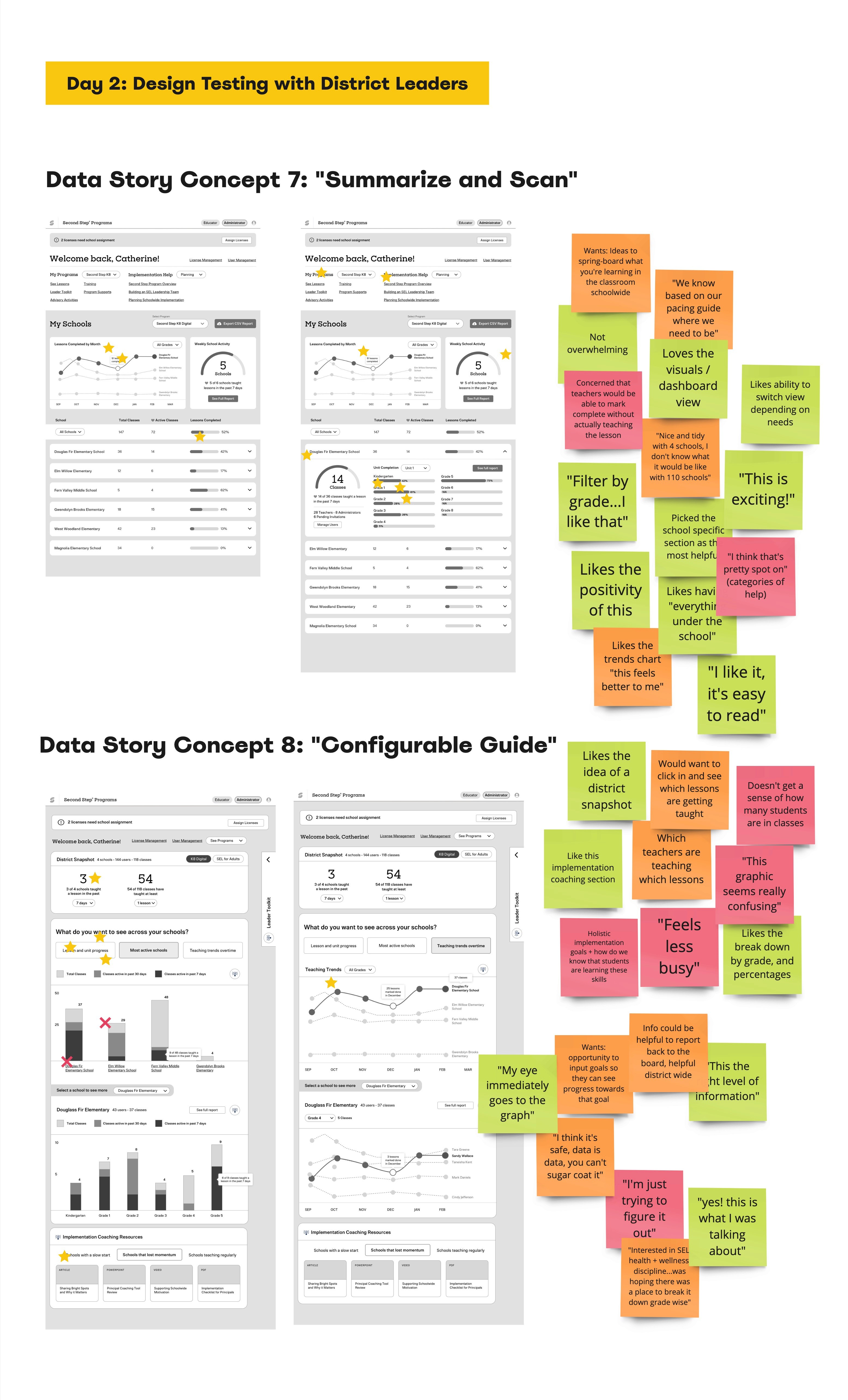
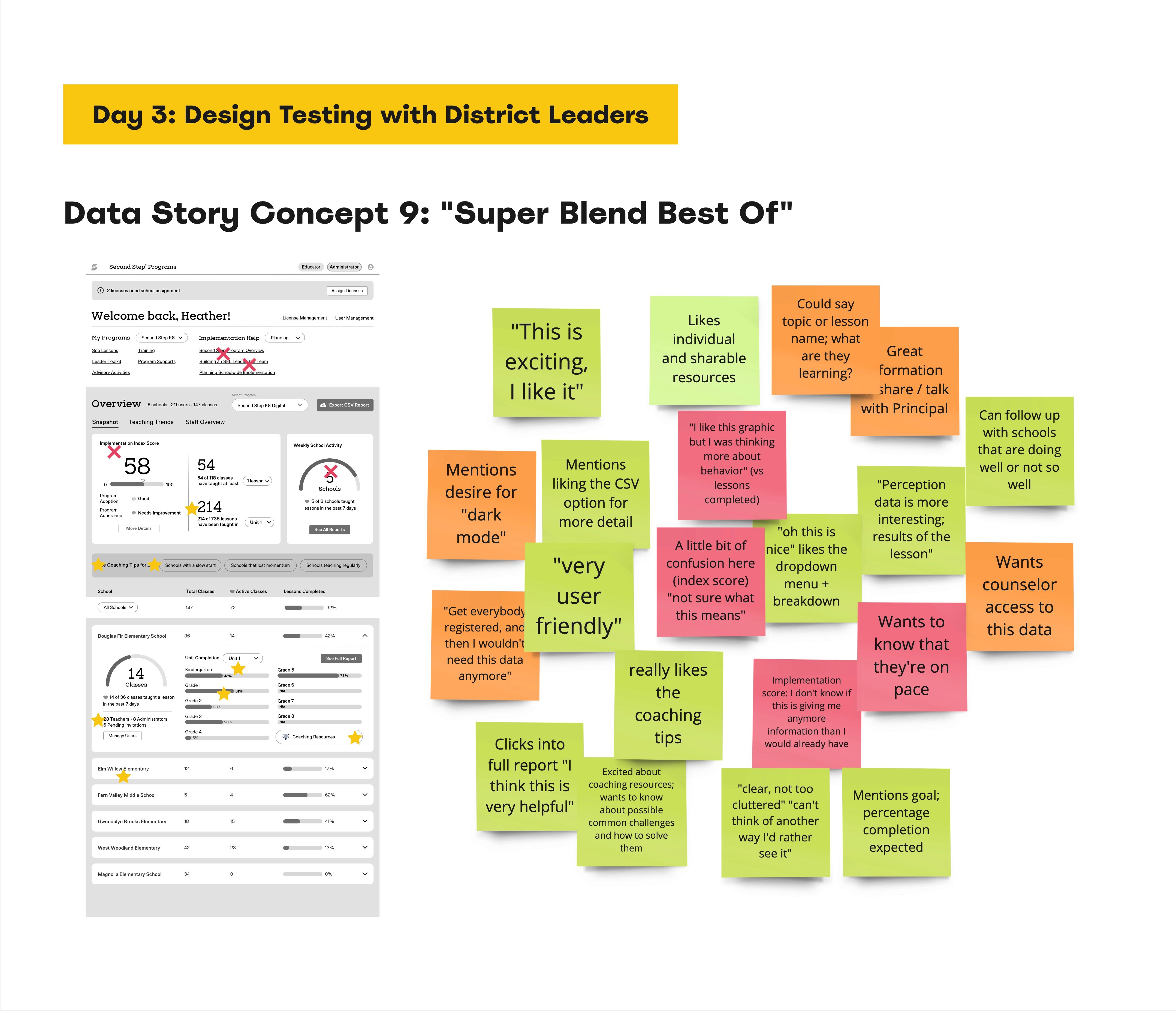
Below you'll see the 9 iterations of design and the feedback of different concepts, all in under 10 days.
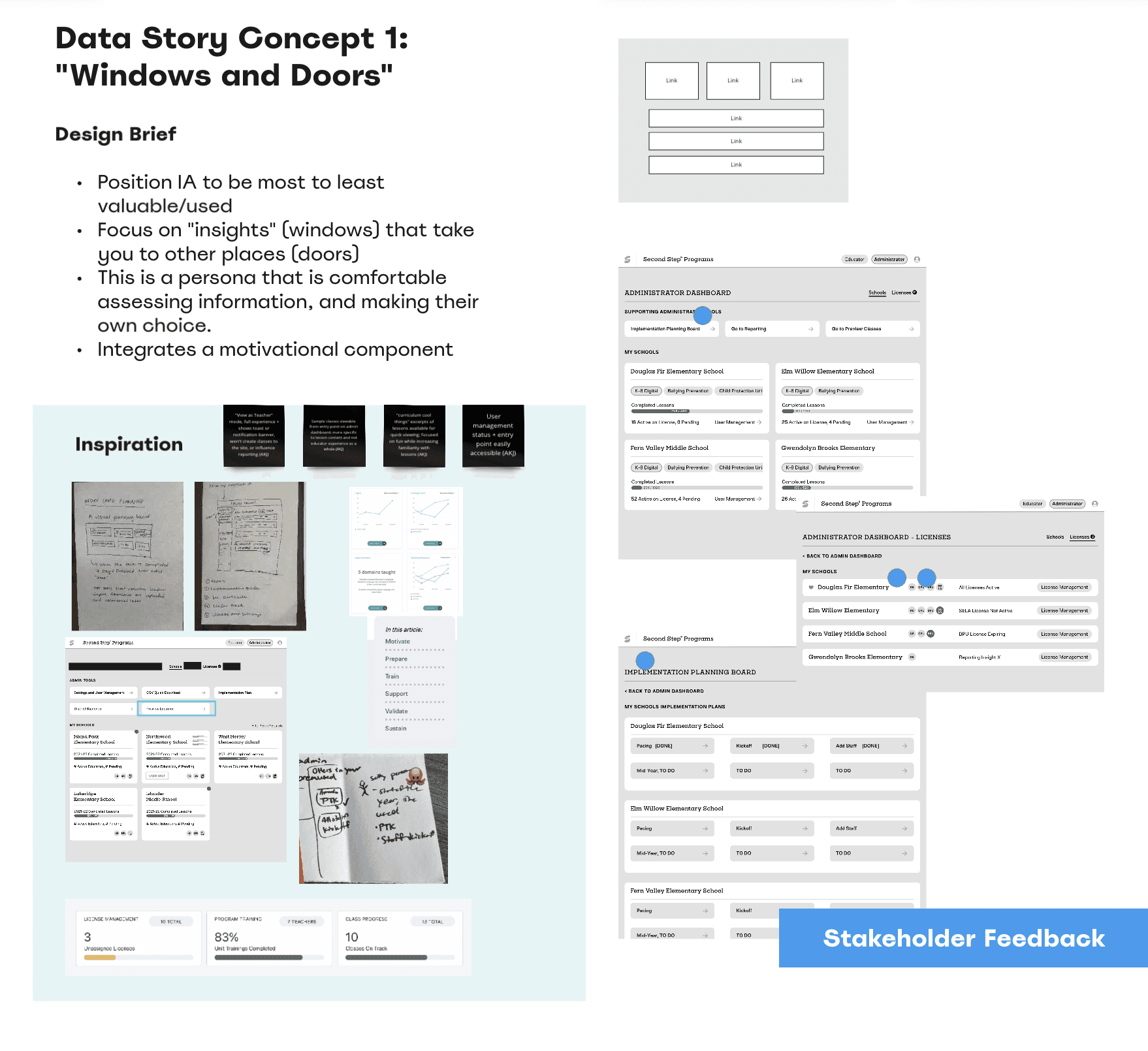
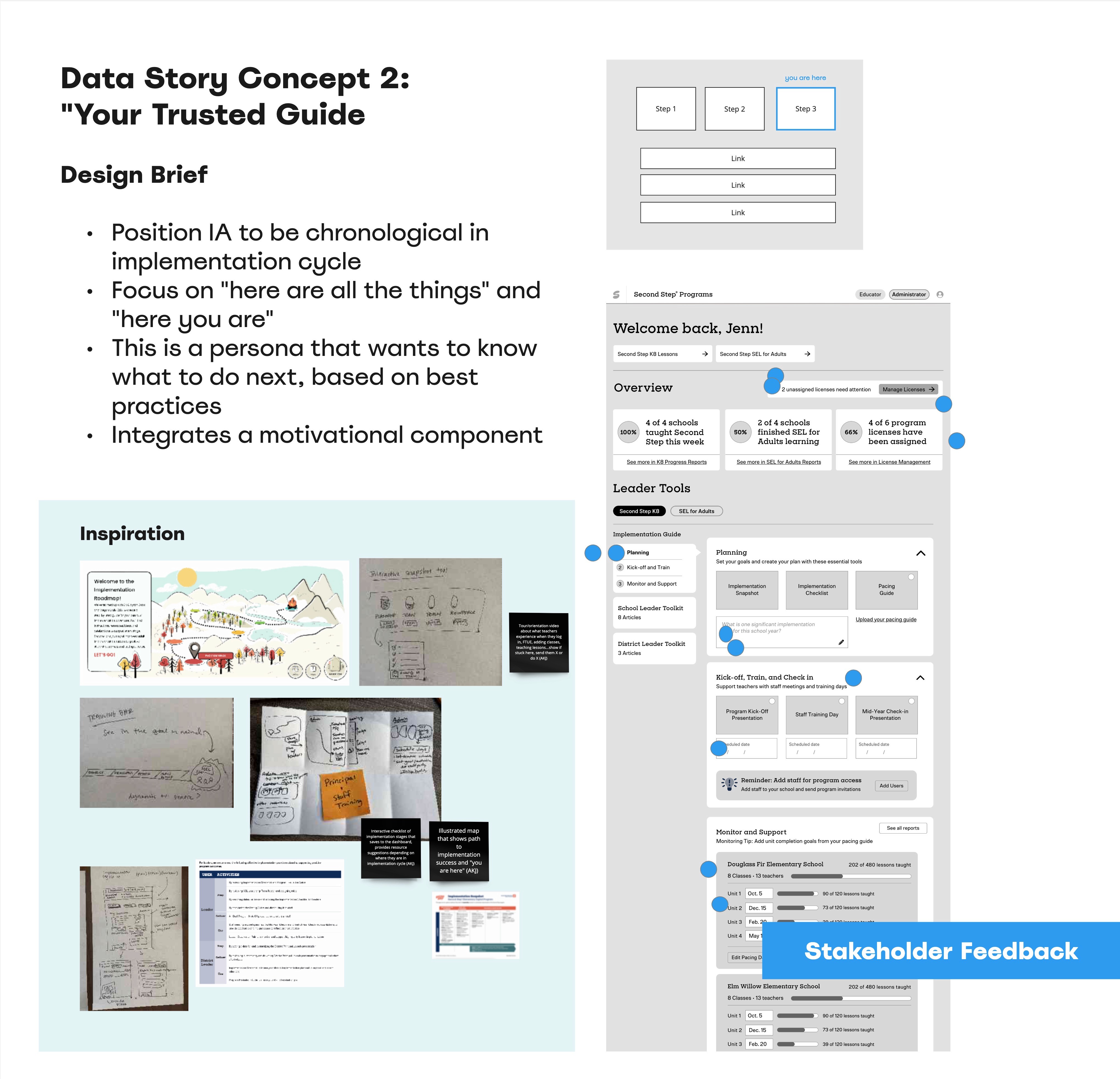
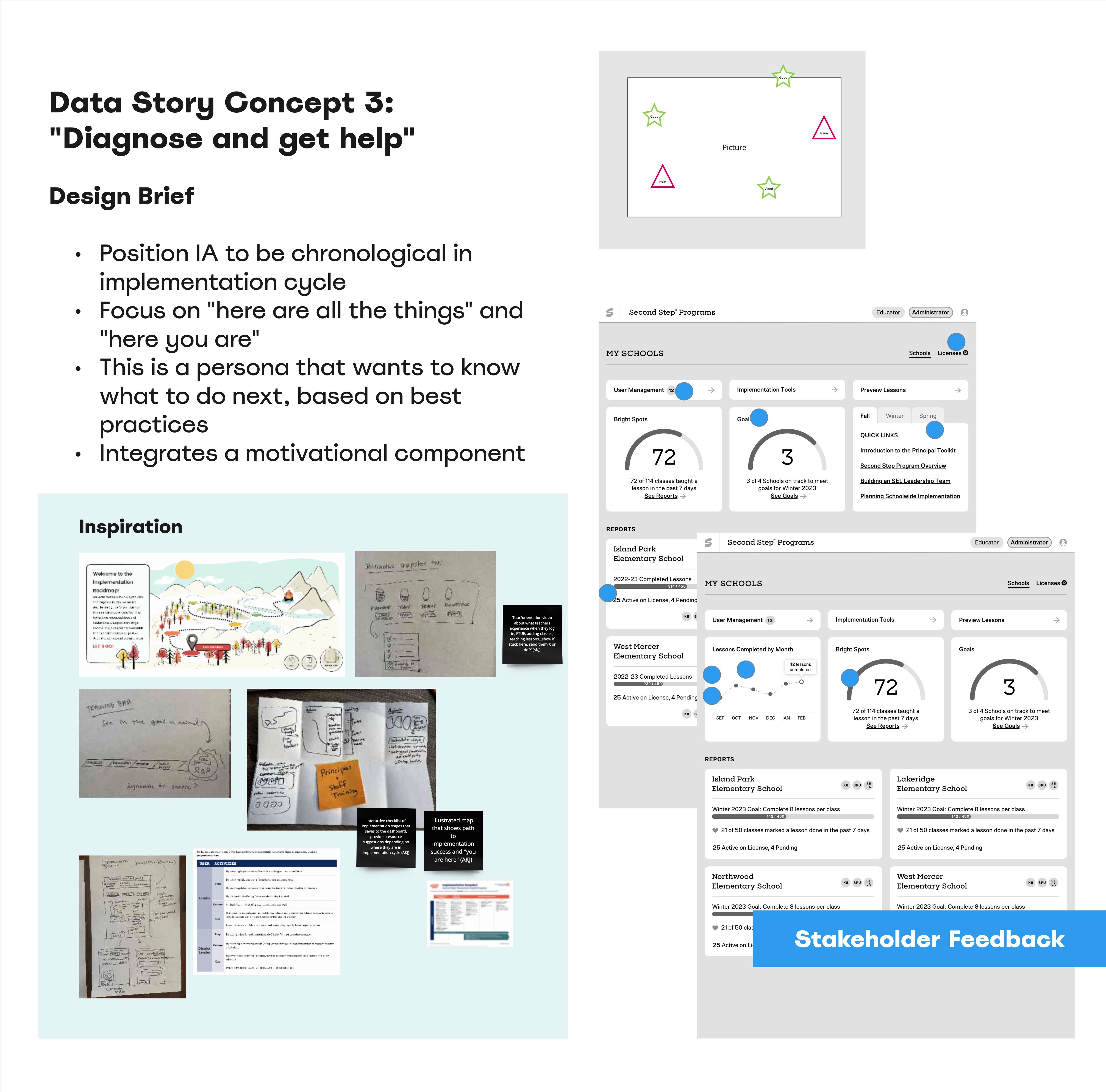
Outcomes and Learnings:
In 10 days, we designed 9 unique dashboard concepts and tested 6 designs with school and district leaders.
The takeaways of the design sprint were:
Wider visibility into the design process; maturing our UX process organizationally.
District Leaders designed with us and helped us establish the dashboard requirements.
We tested many different and varied ideas in a very short period.
A deeper understanding of the segmentation of our user personas and their unique needs and goals.
A clearer path of where and how we’ll focus our energies on the actual design of the dashboard. This included:
Clean, reliable, and accurate data was reconfirmed as a must-have.
Scanning a list of schools at a glance is the most important data visualization. But visualization in general is highly appreciative and powerful. Over-aggregated data loses meaning.
The desire to “drill up and drill down” across the data layer is an important heuristic.
The importance of integrating coaching supports and how to take action from the data.
It helps if there is a clear data story of both how the page is laid out and the what the data tells us.
Method 2: Key Behavior Analysis
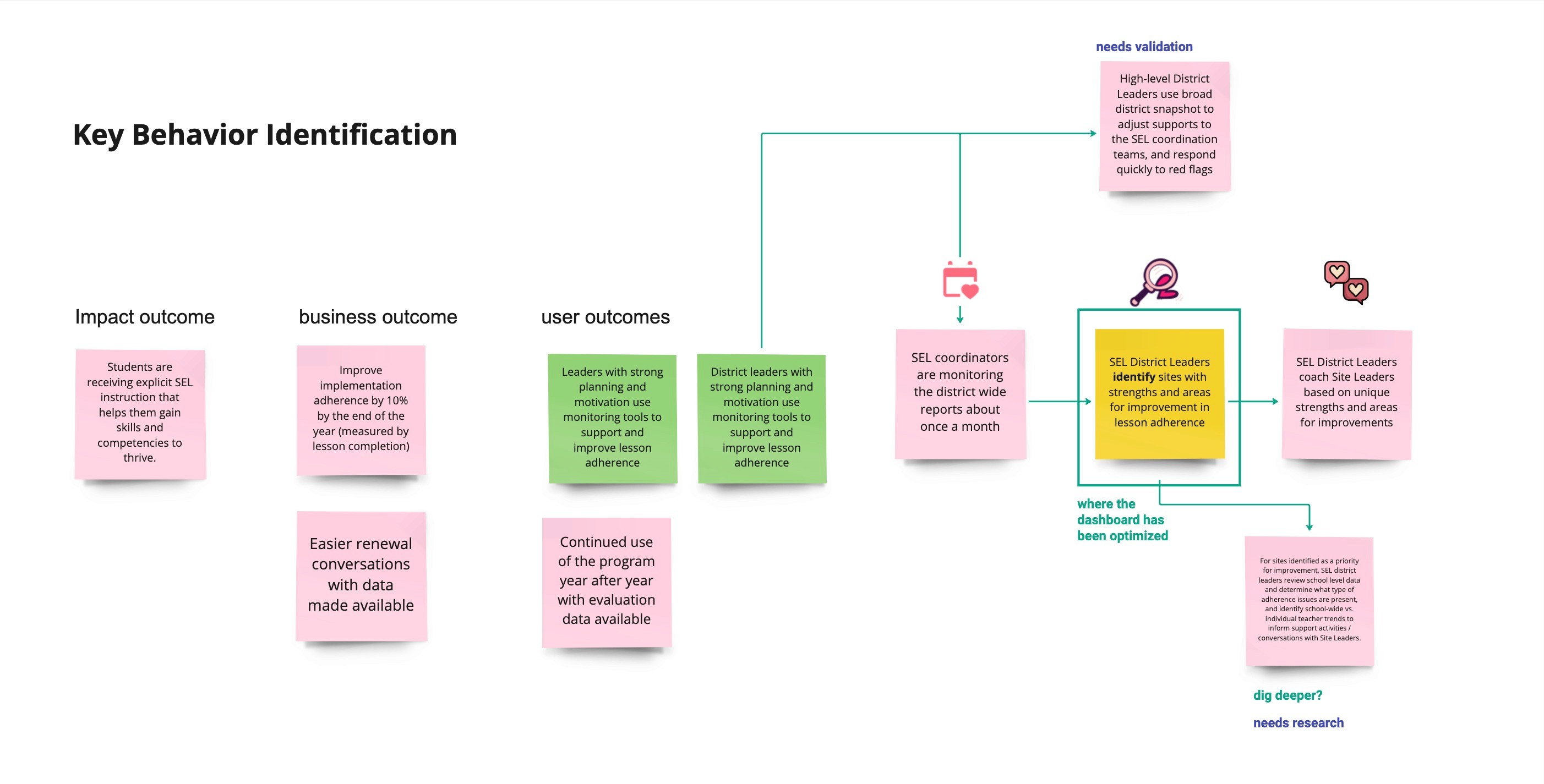
With lots of inspiration from the design sprint, we were ready to find a clear data story and make a hypothesis where outcomes for change can be most impactful, and for whom. This was our first time creating districtwide reporting and the team of collaborators spanned different perspectives and points of view.
We began with a cross-functional team alignment with assumption mapping:
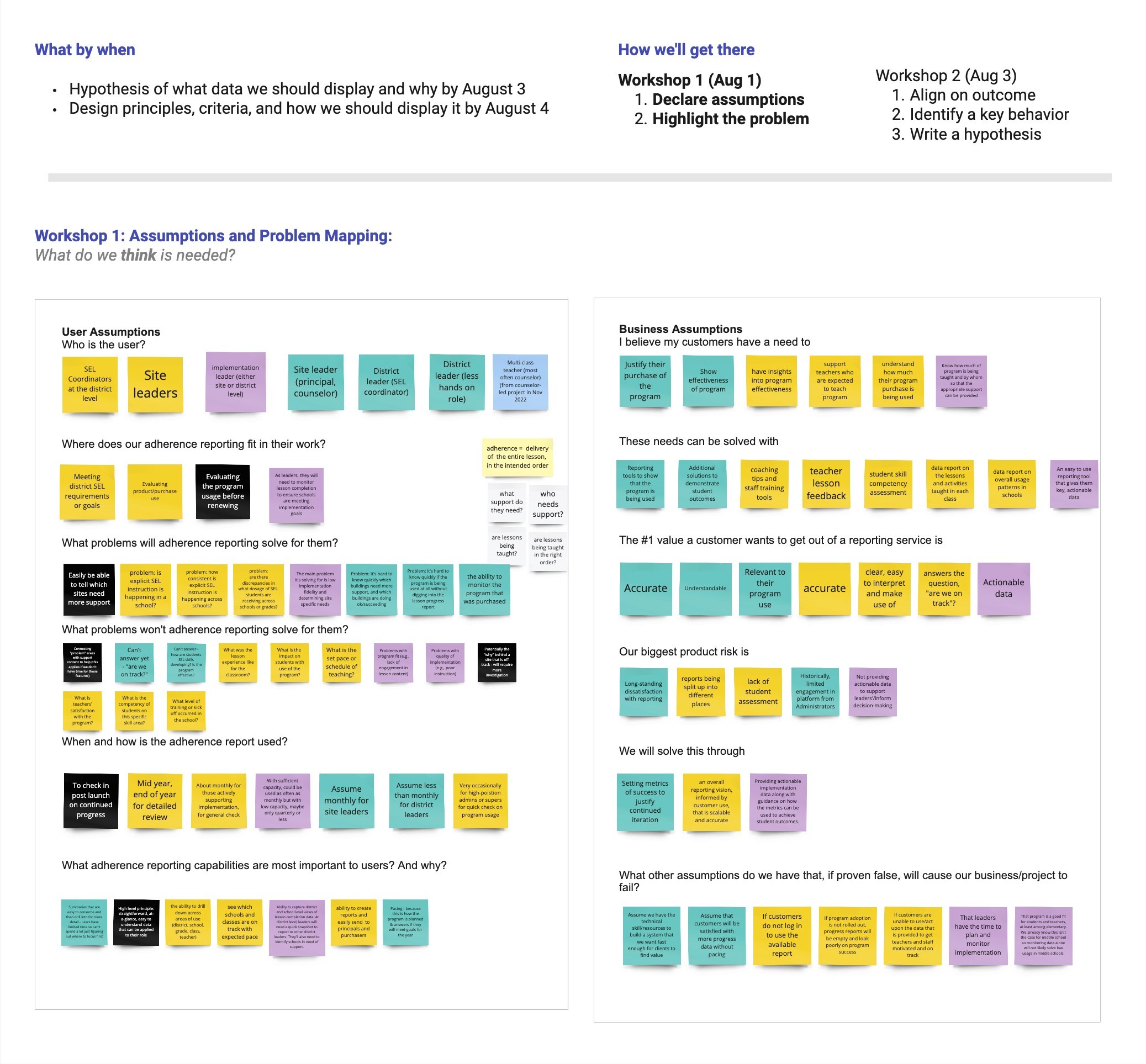
We used behavior mapping to guide a design around a real-behavior that changes for most outcome:
By looking at the steps required for the key behavior to occur, we can identify the barriers to remove and the benefits to amplify that support the key behavior:
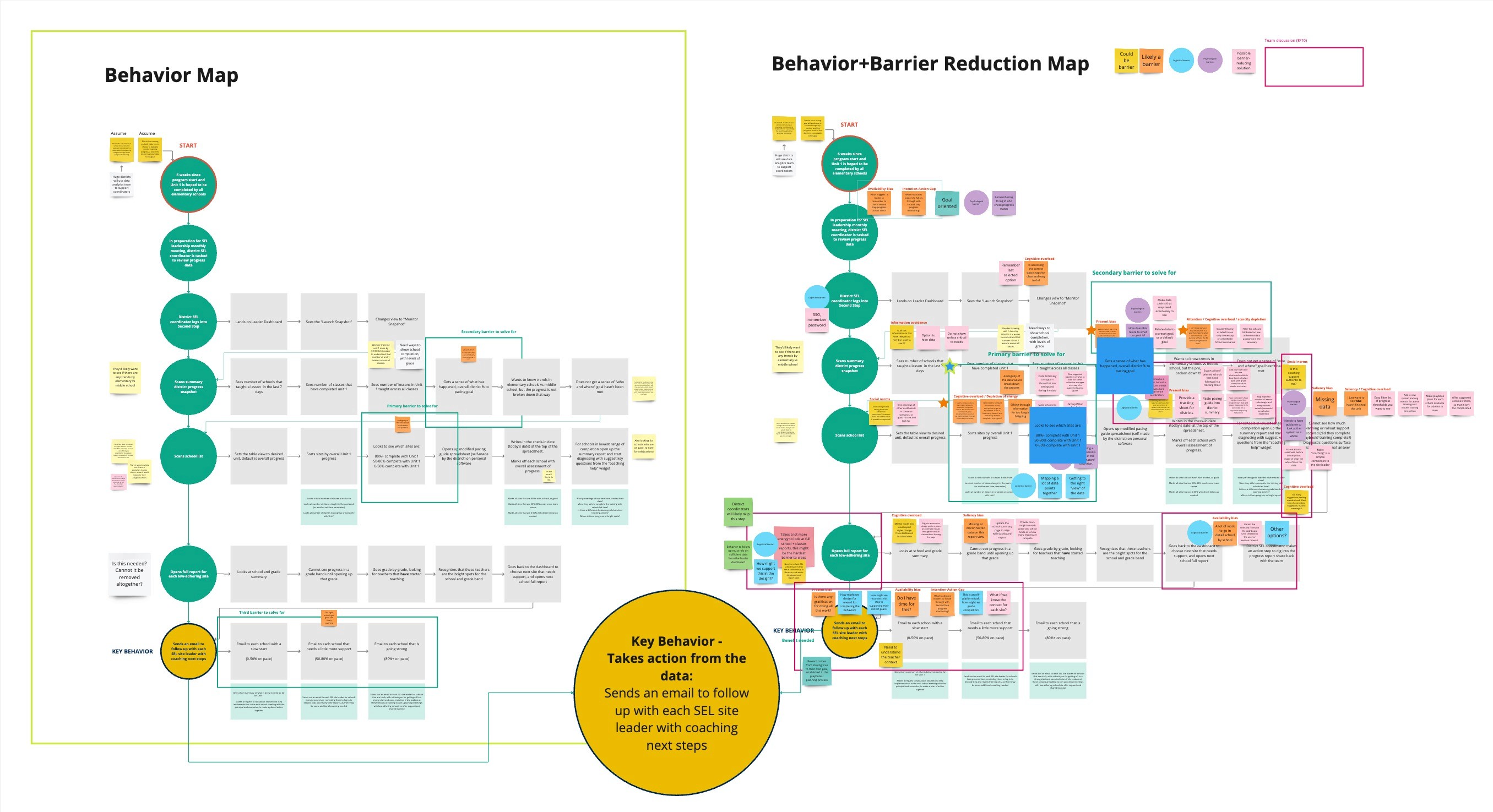
We identified the key behavior SEL leaders identify the schools, grade bands, and classes that need support, and take action.
Glimpse of a few design iterations

Comments from unmoderated usability testing
User friendly, visually appealing, tangible data - Participant 2
Just possible simplification on the red/yellow/green bar graphs. Fractions versus percentages for lesson completion. Also, since I monitor 12 or so schools (my teammates and I all have assigned schools) would the data mimic the whole district or just my 12 schools? Would there be a way to look at my 12? Only other thought is being able to click on each school to dive into their data if more specific information is needed -- that would be awesome! - Participant 6
The only confusing part were the district graphs at the top with the red, yellow, and green, showing who had started and not with different percentages. Maybe a pie chart instead? I don't know why bar graphs like that are confusing to me but they are. - Participant 11
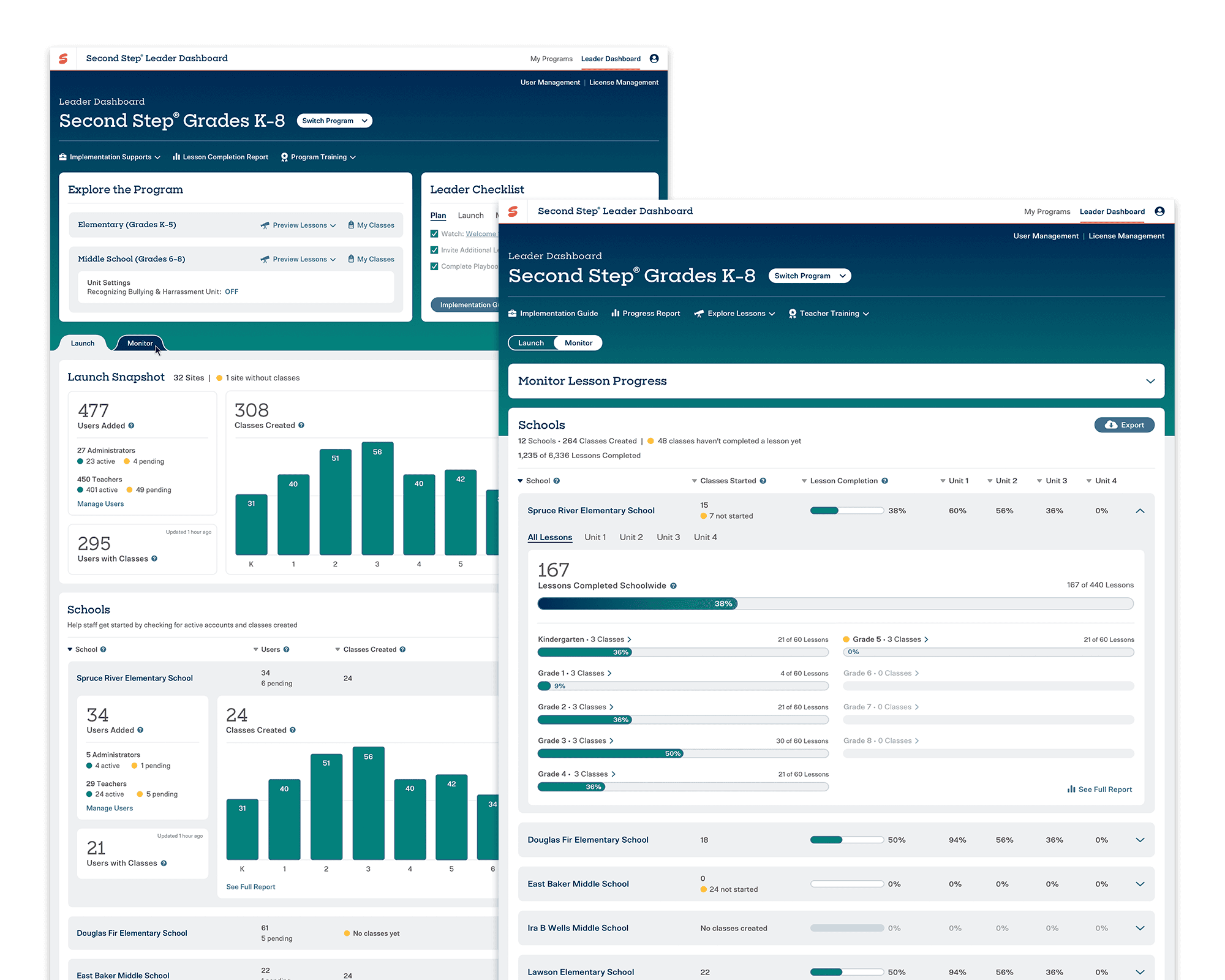
Final UX, UI, and Release:
In conclusion
We did make a pivot at the very end of the design process. We considered the feedback from usability participants, and after many rounds of trying to summarize the data meaningfully for a district, we agreed that all signs pointed out that a district summary would be a later feature.
Up Next: We have seen a common behavior of leaders "tiering their schools" in buckets between "on track, a little behind, and off track". We are beginning the next phase of this project which is school pacing. This will allow us to provide "on/off track" data context, and enable us to create powerful district summary visualizations and assist leaders in more closely monitoring implementation fidelity with ease.
Acknowledgments
Special thanks to the super stellar product manager Sara Hasson, who is like my other brain. She is an incredible synthesizer and leader and fully trusts the design processes.
Another big appreciation to Anne Babb, whose UI talent never fails to deliver beautiful, compelling, and clear interfaces for SEL educators.