Quality Data for School Leaders
Improving the usability of progress data for school leaders
The Situation
The product team could not deliver complete progress monitoring features when the new platform for the SEL programs was launched. A temporary solution was implemented and was unaddressed to improve for over a year.
With time, we heard several customer issues with using the report as is and it became imperative to address the root causes of the reporting issues.

User Context
School leaders don't see enough data on the screen to make sense of the progress happening in the program.
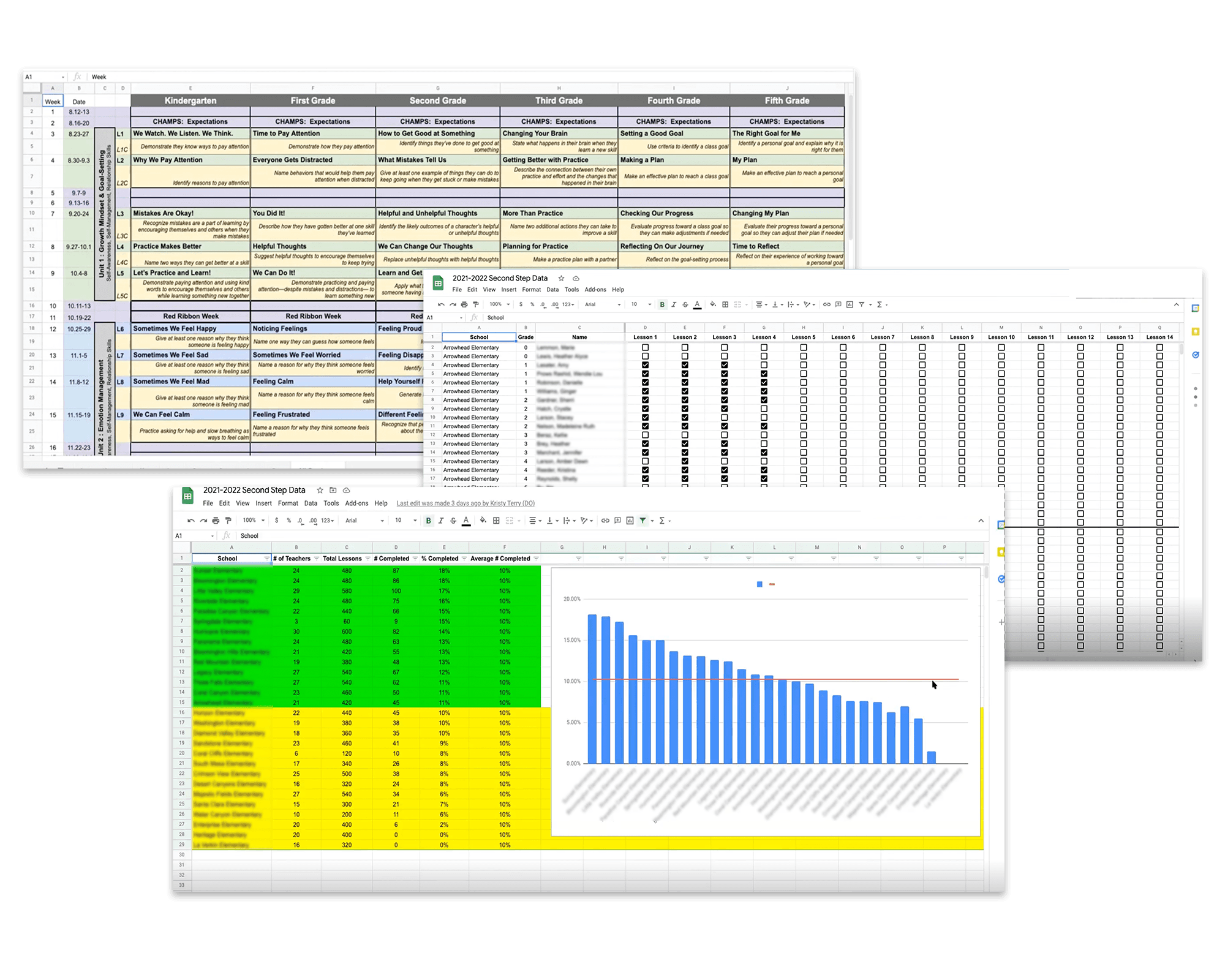
Downloading a CSV report works for some, but in general is pretty cumbersome.
Data in the CSV report was often inaccurate or skewed, making it challenging to rely and trust the data.
Business Context
For too long school leaders haven't had access to the data they need and it is impacting product satisfaction.
Buggy reporting is considered one of the program's biggest weaknesses.
Better reporting will assist with sales and product requirements for prospective purchasers.
Technical Context
Classes have to be created to see the program lessons.
A recent upgrade in the reporting database will allow the platform to display data faster.
Engineers were committed to build other product features before having capacity to fix K8 reports.
Synthesizing the Research
The engineering teams were at capacity working on a different program which contributed to the delay in resolving known usability issues with the initial report feature. The product team knew the reporting features weren't great but needed to learn more about why. During this time I conducted a few research efforts to understand the nature of the pain points and get to the root of addressing the problems.
Empathy First: Customer Interviews
I interviewed many stakeholders to learn the needs and known problems with the report. This included district SEL leaders, school principals, counselors, client support staff, product managers, engineering, instructional design, implementation scientists, and research.
We learned how school and district leaders had to take time to make their reports because the product capacities were so limited:
Key Learnings from Interviews:
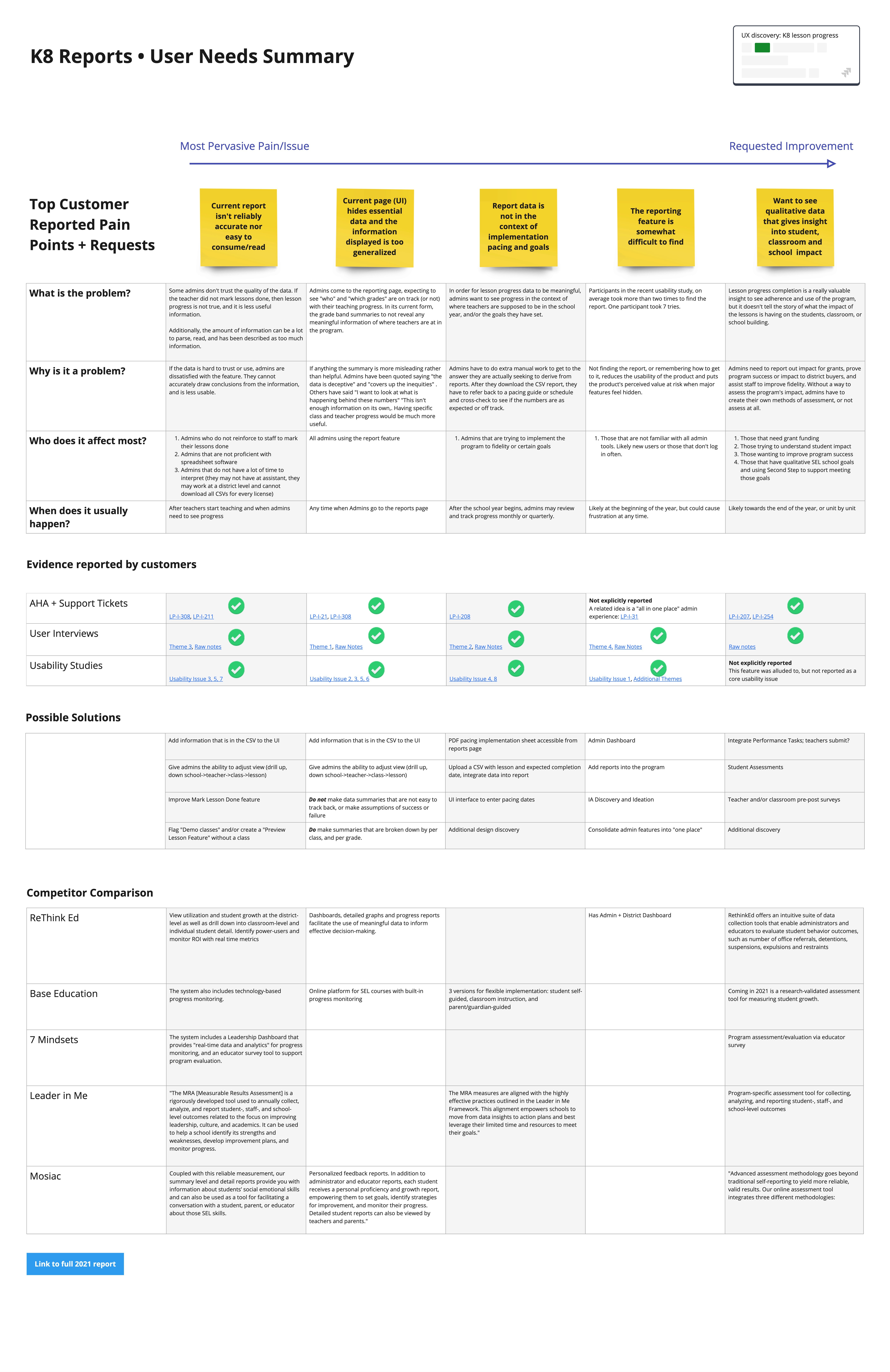
Make data accurate, usable, consumable, and reliable.
Give me a district view where I drill up or down across schools.
Lesson progress is important, but staff and school activity is also meaningful.
Show me "Bright Spots" where it is going well across and within schools.
I’m not teaching lessons, but still need easy program access.
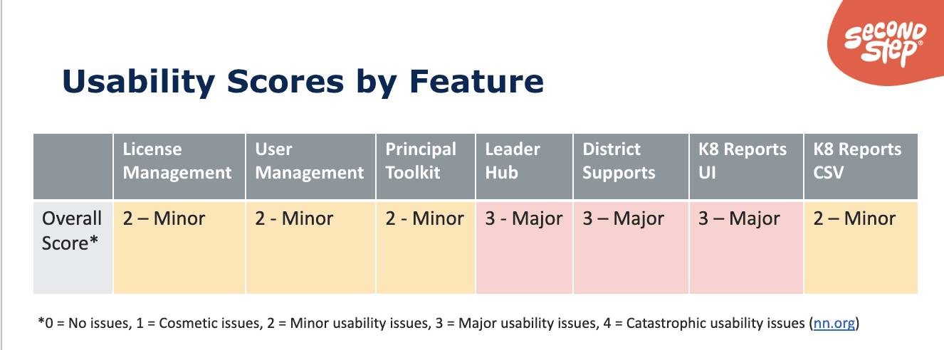
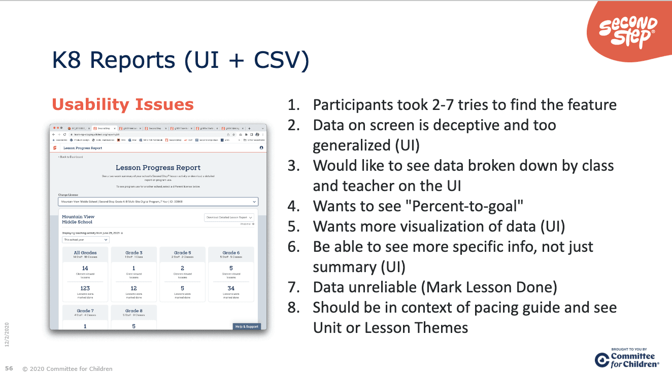
Get a Baseline: Usability Benchmark Study
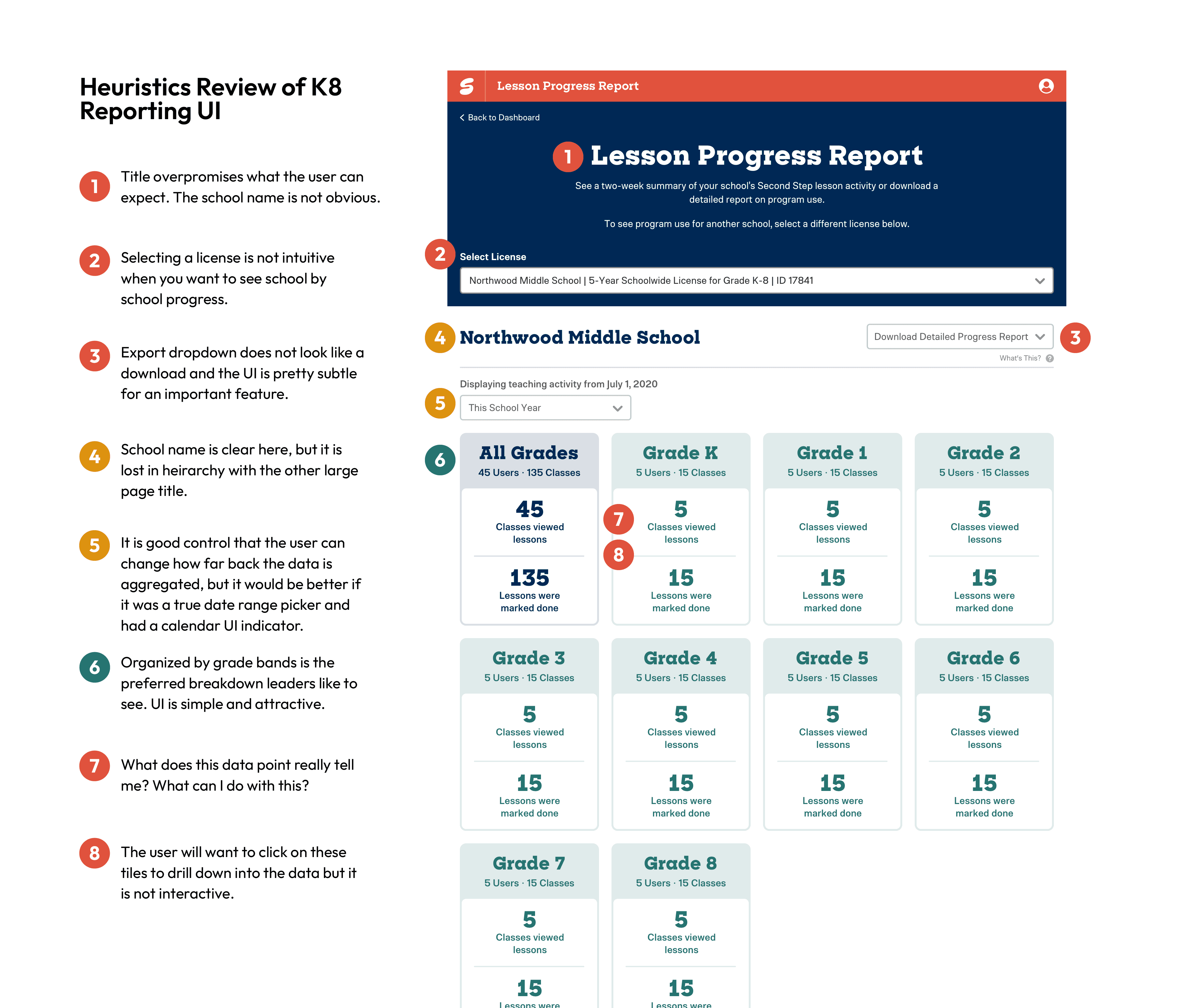
Assess the Current Situation: Heuristics Review
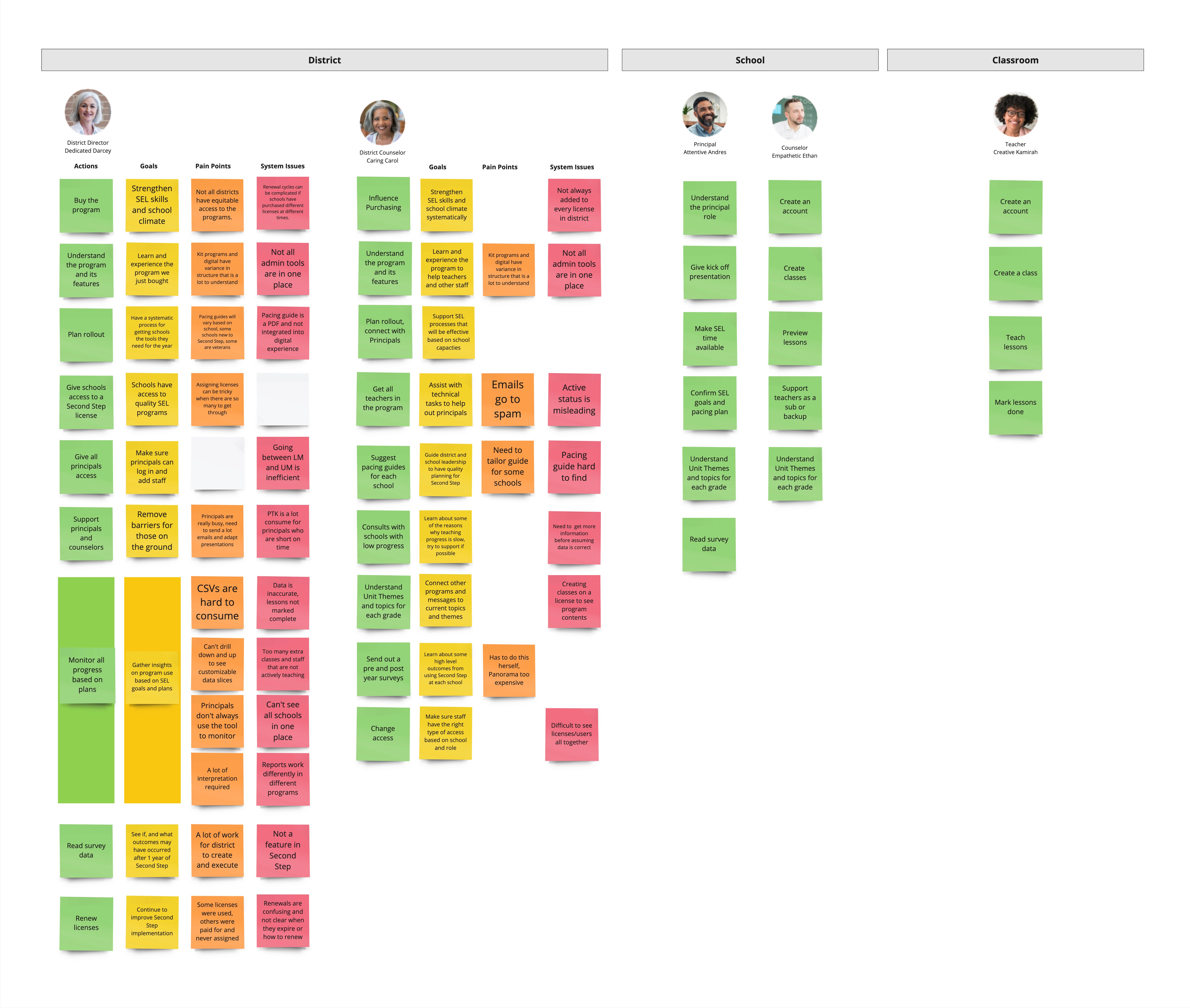
Visualize the Problem Space through Different Persona Goals
Put it All Together: User Needs Across Research Initiatives
Map the System to Leverage UX Opportunities
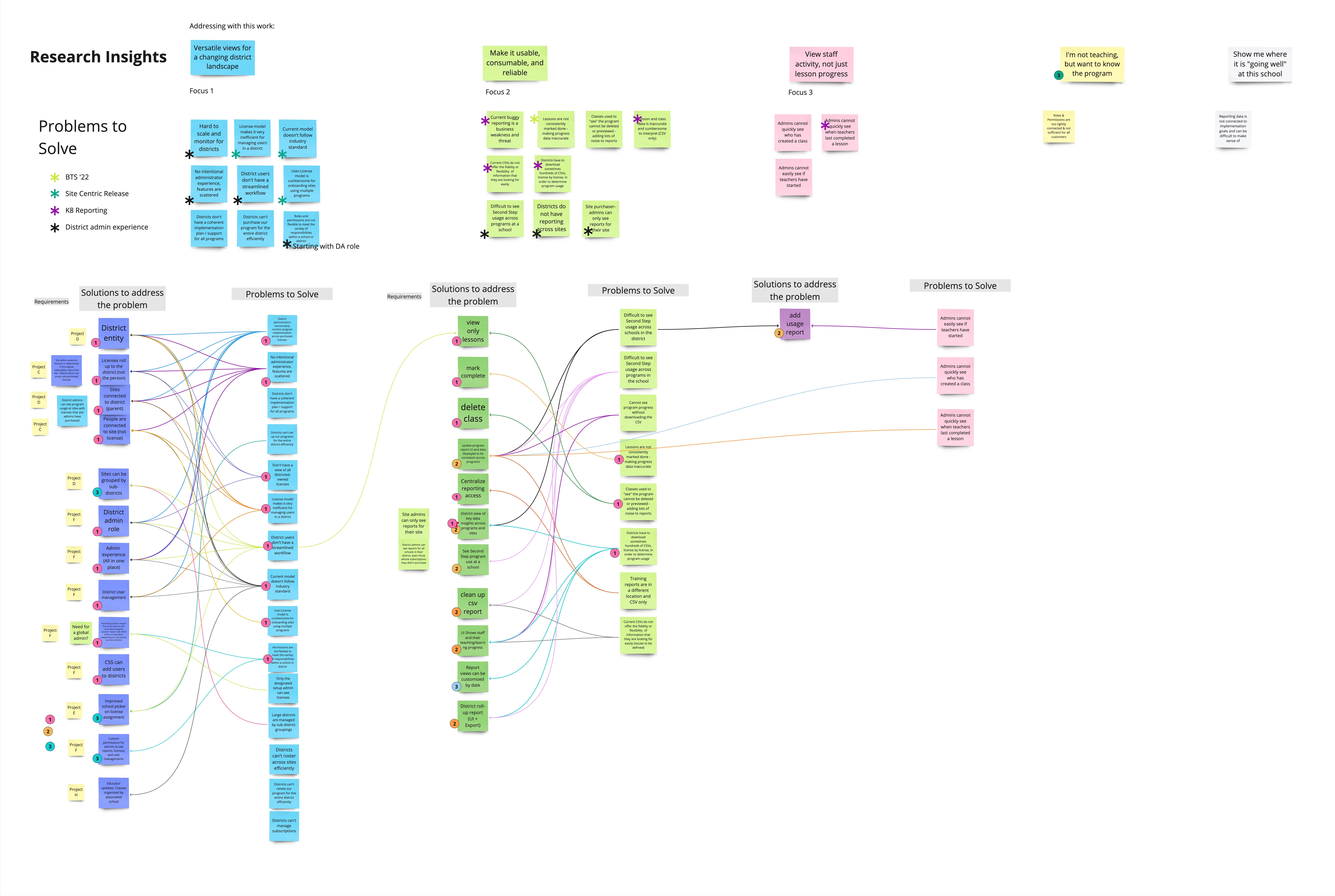
Hypothesis
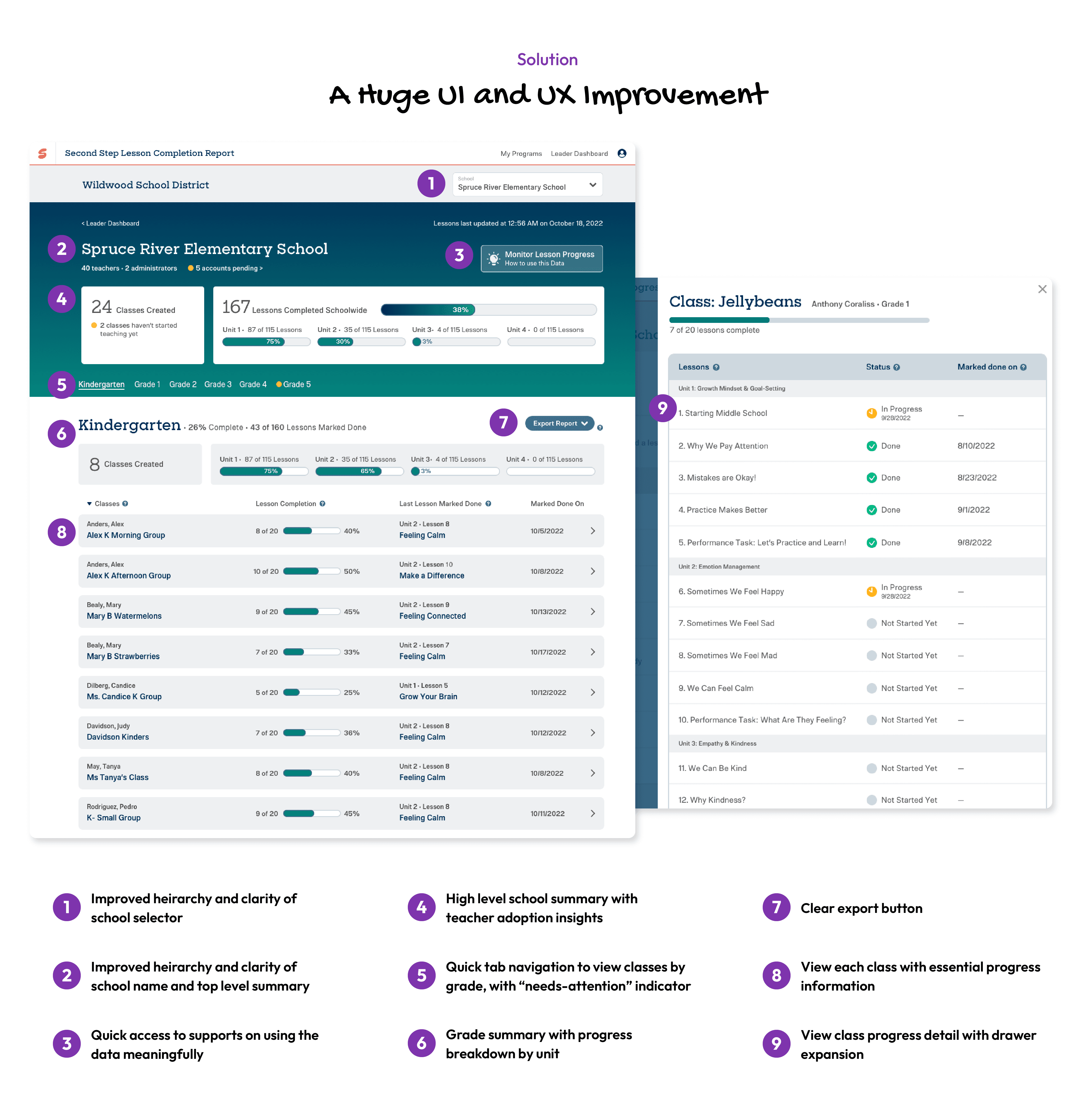
We believe that if admins can see progress accurate data for Second Step K8 lessons by school, grade, staff member, and class when they land on the reporting page we will achieve greater adoption of the reporting feature and increased user satisfaction with the admin features in Second Step.
We will know if this is true when we see:
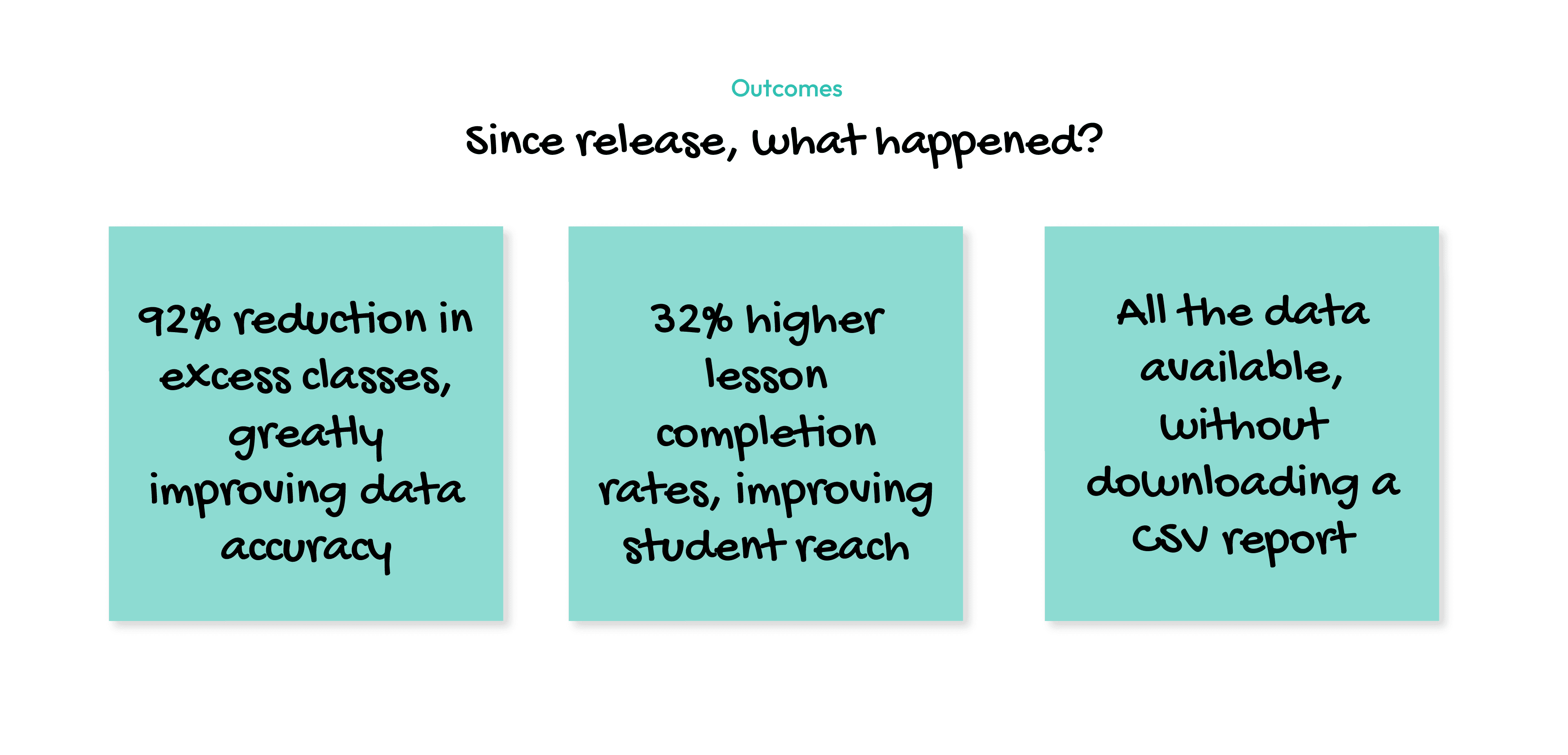
80% reduction in demo classes
SEL Leaders can confidently answer progress-related questions with the information visible without downloading a CSV report
The average usability score will improve to 2 across all participants
Step 1: Clean The Data
We learned that a data report with bad data is no better than no data at all. We needed to take three interventions that related to the teacher's experience to get reliable data for administrators. These enhancements were chosen with a hypothesis that they would get at the root cause of excess or inaccurate data.
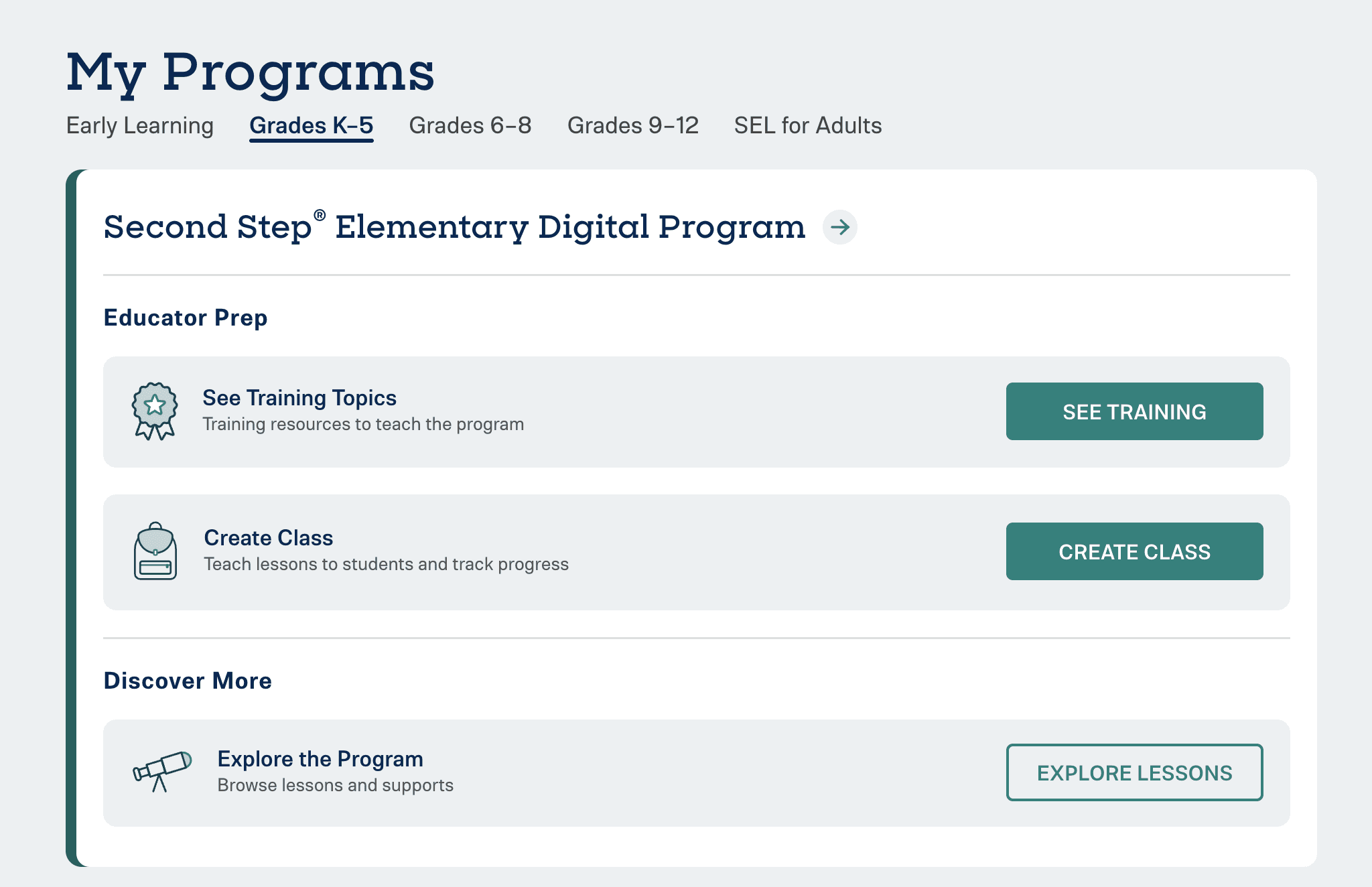
Intervention 1: The “Explore lessons” feature reduced extra classes by 85%. The feature also created easier lesson access for all users. This feature was well received soon after release, administrators and teachers adopted the "explore lessons" language in their interviews and comments, signifying that it was intuitive and useful.
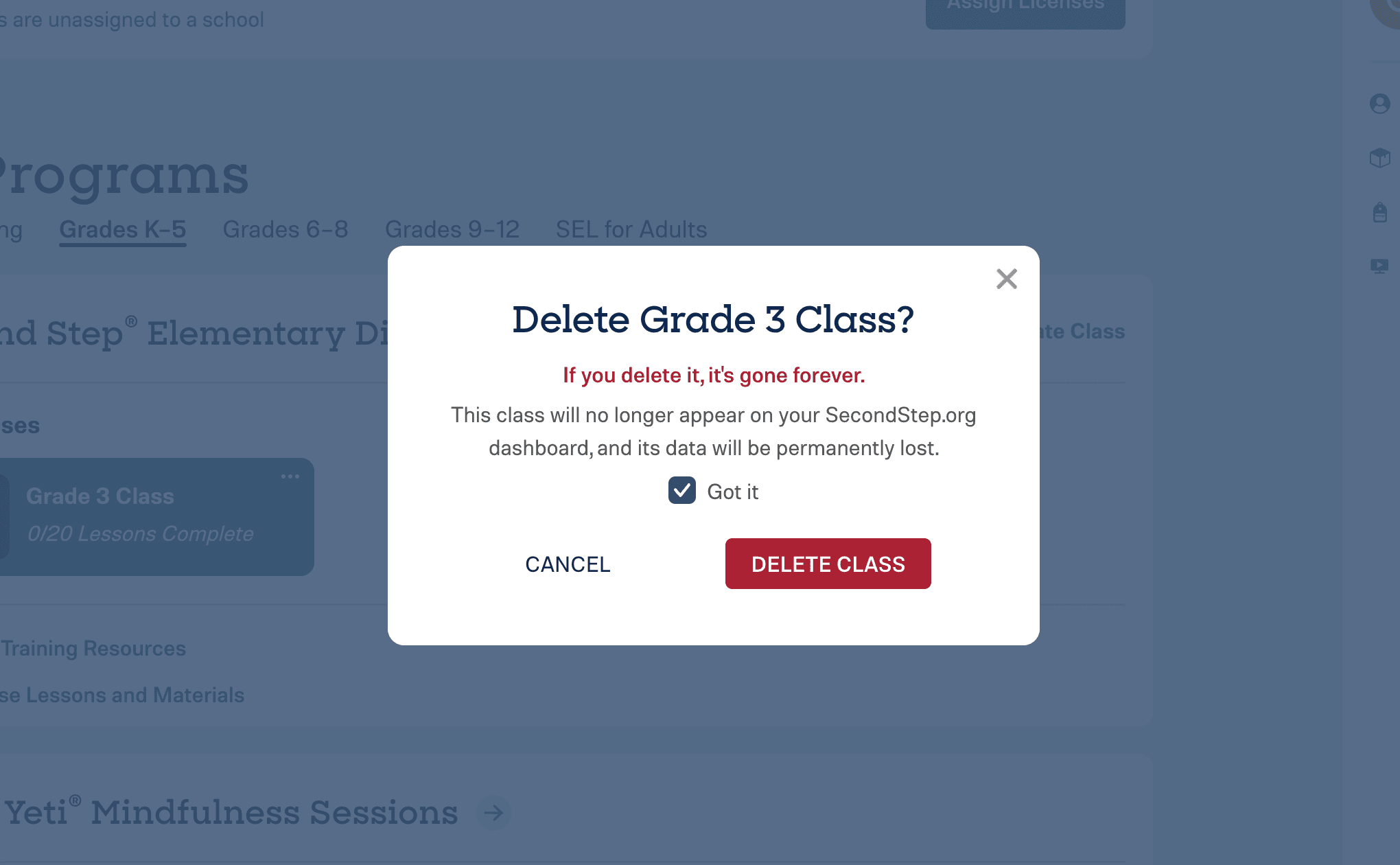
Intervention 2: The “Delete class” feature was long overdue and helped clean progress reports and remove the clutter of extra classes on the user's dashboard.
Intervention 3: The “Mark done” modal on the lesson player would appear to remind teachers to mark their lessons done. This also helped with increasing our post-lesson teacher lesson survey completion rates!
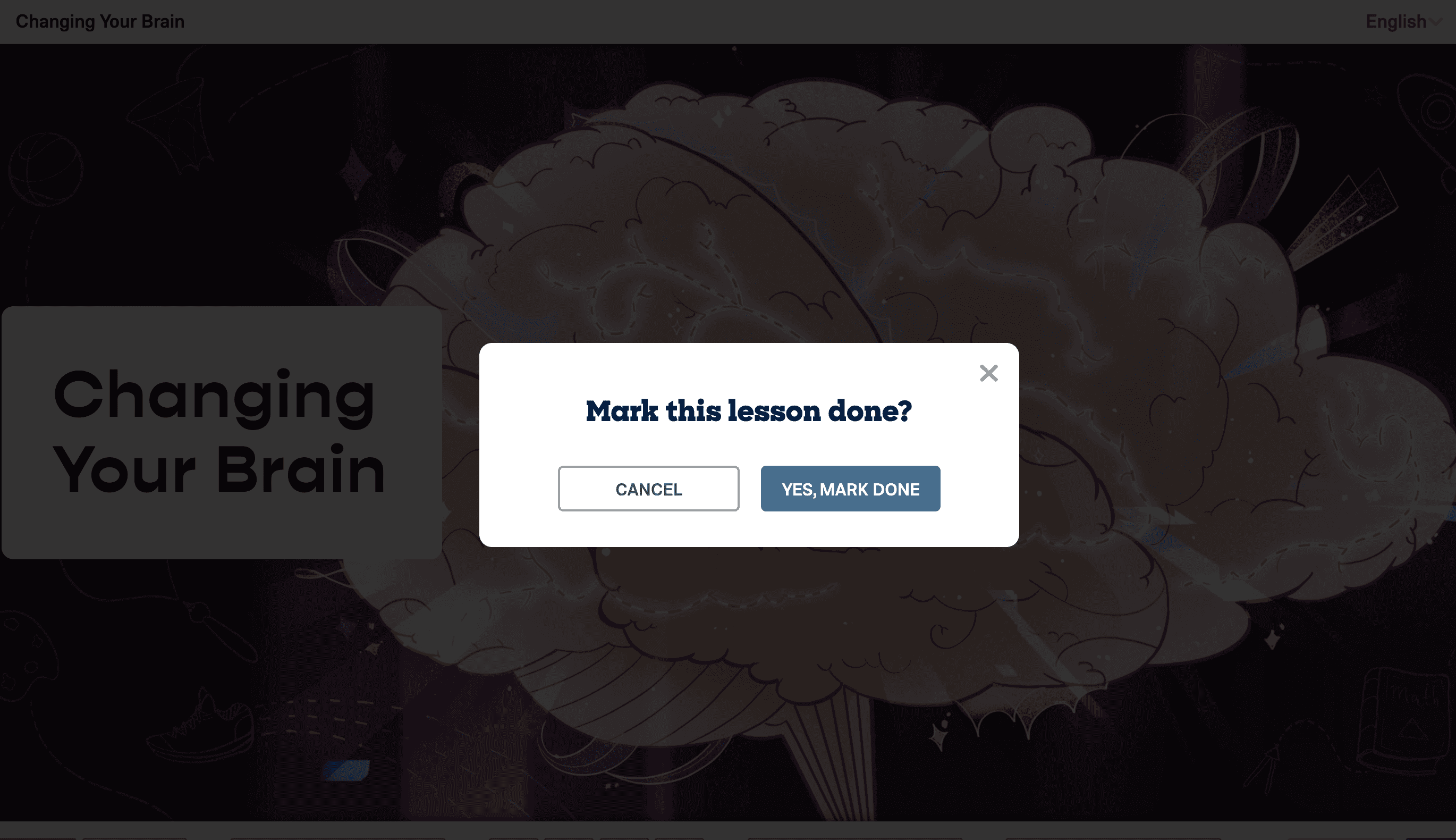
Learnings and Outcomes from the Data Clean-Up Project:
By listening to the top pain points expressed by leaders and digging into the root causes, we prioritized the importance of three independent interventions. Sometimes the "solution" must be multi-pronged.
After completing all three interventions, our confidence in explicitly sharing lesson completion rates increased greatly, allowing us to make more robust UI designs.
Not only did we meet the needs for accurate data, but we also gained many other experience wins:
Greater access for teachers and leaders to use and explore program materials.
Teachers keep their dashboards tidy for quicker class selection.
An increase in lesson feedback surveys exceeded our Survey Monkey limit of 5000 forms a month!
Step 2: Improve the UI
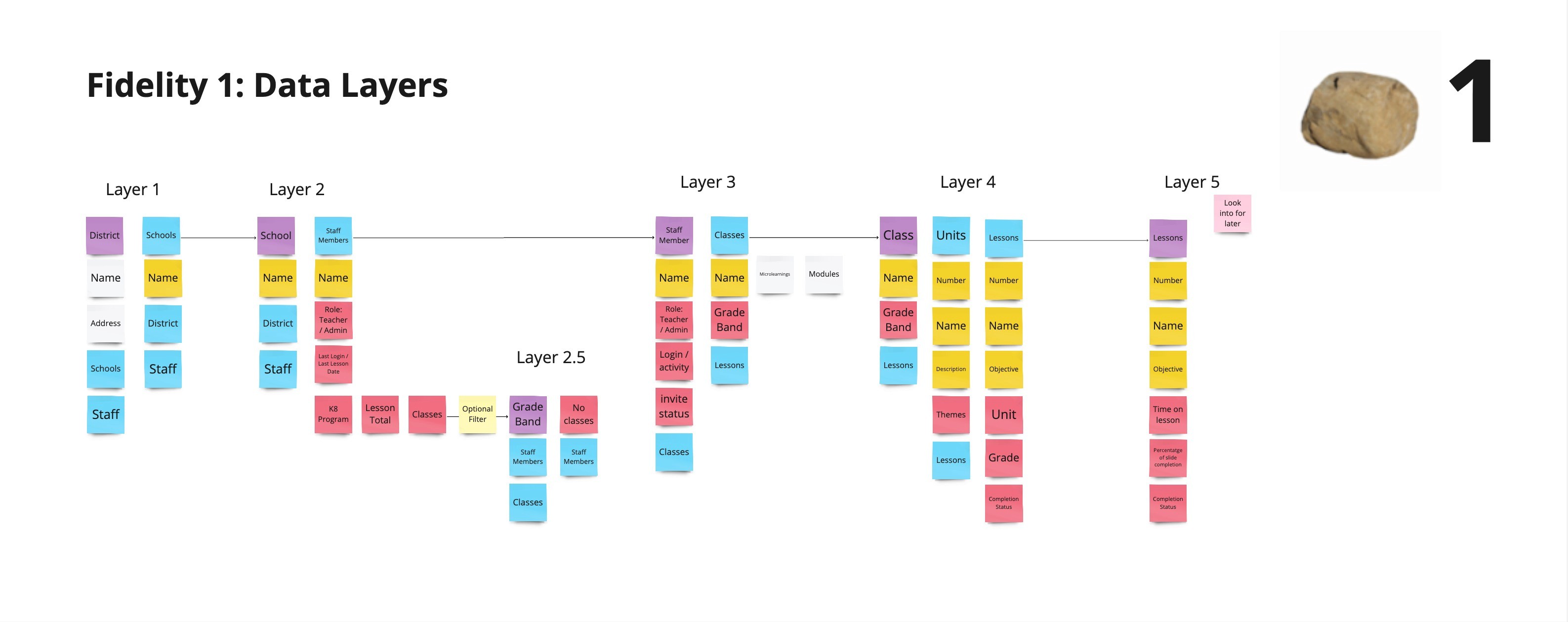
A sketch of the data types I was working with, and how a leader would drill up and down and get different views
Two distinct UI Concepts to get feedback on from usability testing
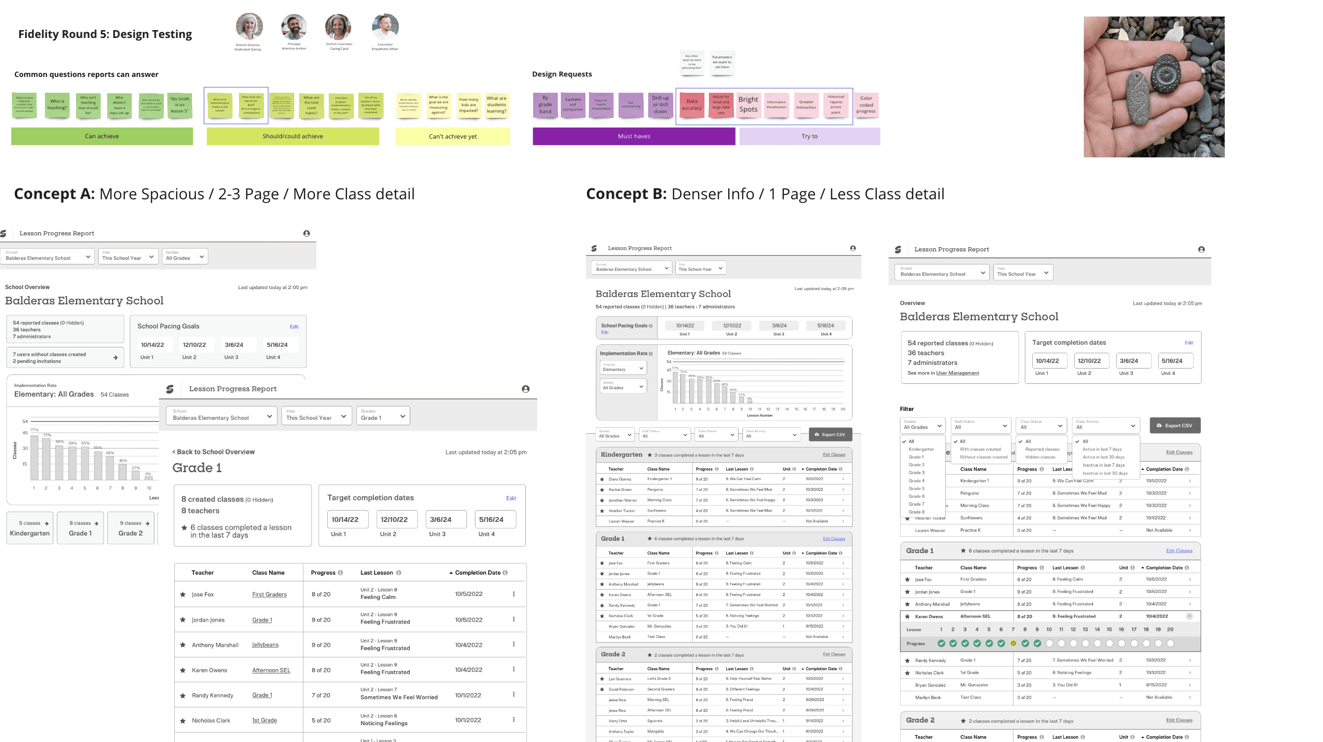
Additional UX Iterations in response to usability testing
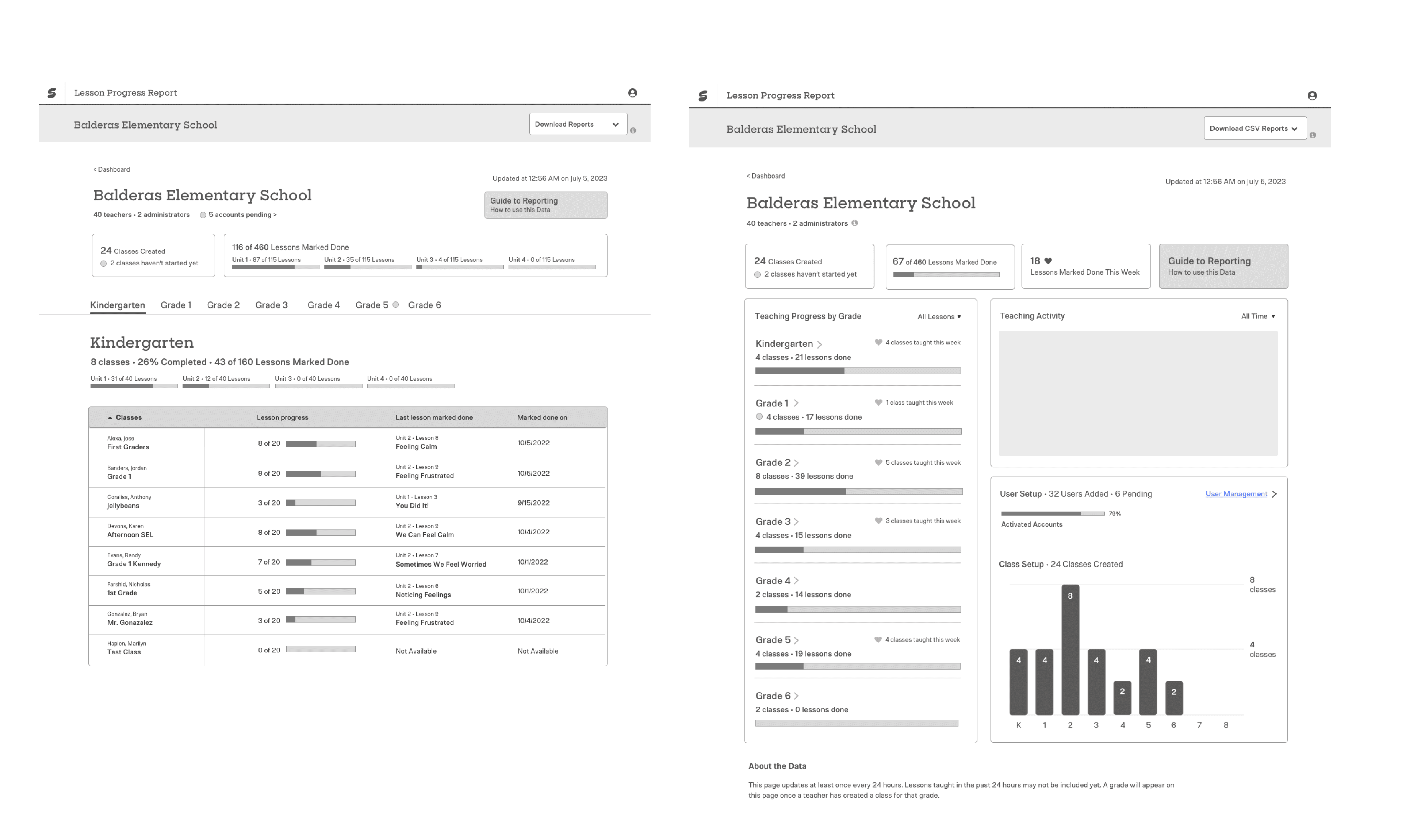
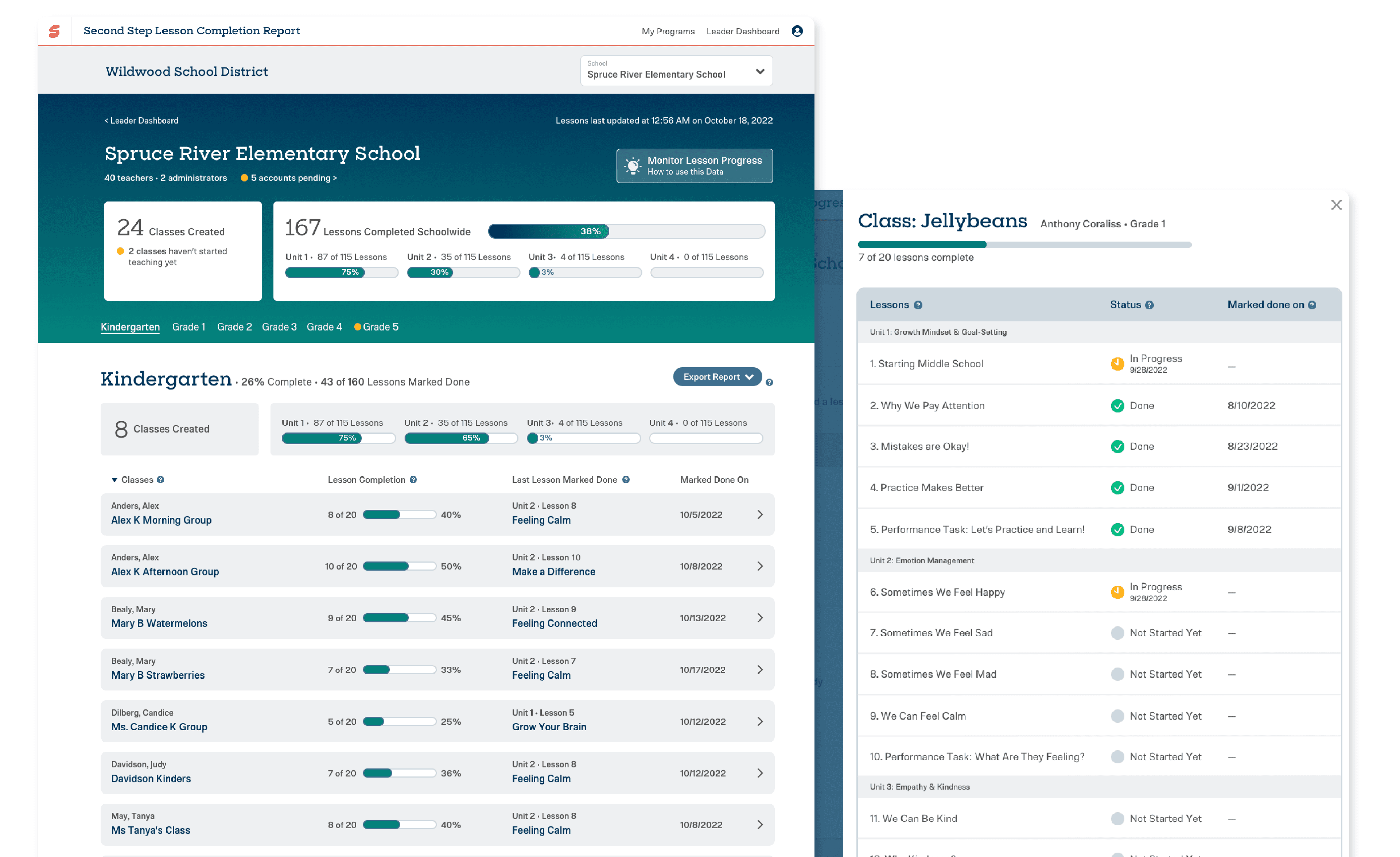
The Result
